Alt Text for Product Images: A Practical SEO and Accessibility Guide
Alt text is not a place to stuff keywords, but to clearly describe product images for both search engines and users. This guide explains which images need alt, how long and what to write, and how to implement it in Shopify with concrete examples.
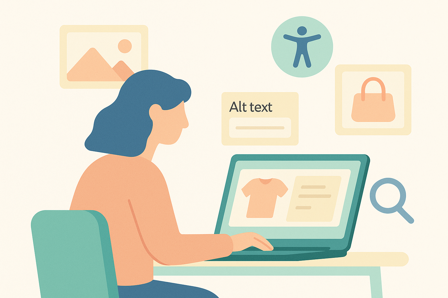
Alt text on product images directly impacts both SEO and accessibility. In reality though, it often gets pushed back because you may not know what to write or do not have time to add it to every image. You do not need perfect alt text on every single image. But even if you only add short, specific alt text to images that help customers decide whether to buy, you can improve both search traffic and user experience. The key is to define rules you can start applying today and run them as an ongoing process.
This article focuses on what Shopify store operators can realistically handle day to day: which images should get alt text, what to write, bad and good examples, and how to configure everything in Shopify. At the end, there is also a short section on how to make use of this when you are using RecoBoost.
Why Alt Text Matters: Its Role in SEO and Accessibility
Alt text is originally intended to describe an image in words when the image itself cannot be seen. Users with visual impairments rely on screen readers to read out alt text to understand product information, and when images fail to load due to a poor connection, the alt text is displayed instead. From an ecommerce accessibility perspective, if images that affect product choice have no alt text, users are effectively unable to compare products at all.
Search engines also cannot fully understand the contents of an image, so they use alt text as a clue to determine which product is shown. Google’s official guidelines for image search optimization recommend concise, easy‑to‑understand alt text that is highly relevant to the image. Depending on the business, image search can account for several percent up to around 10% of traffic. For visually driven categories like apparel or interior goods, you cannot ignore it.
At the same time, alt text is not a dumping ground for keywords. Google clearly states that keyword stuffing can be treated as spam and hurt your rankings. To balance SEO and accessibility, write alt text from the perspective of explaining in a single sentence what the image shows to someone who cannot see it, rather than writing for search engines. That is the safest approach and ends up benefiting SEO as well.
Which Images Should Get Alt Text: How to Set Priorities
It is not realistic to hand‑write custom alt text for every image. For stores with many SKUs in particular, the operational cost becomes high and there is a real risk that updates will stall. So first, prioritize which images will get alt text.
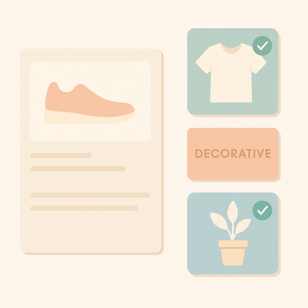
- Must have: the main image on the product detail page (the large first‑view product image)
- Important: variation images that differ in color, pattern, or details (other colors, back view, close‑up of material, and so on)
- If you have capacity: key visuals on the home page or collection pages, when they clearly represent specific products
- Generally no alt (empty alt recommended): purely decorative icons or background images, borders or shapes with no meaning
For example, an apparel product might have 10 images, but customers usually base their purchase decision on one to three images that show the full product and another two to three that show details. If you limit your rule to writing alt text for those five or six images, you can cut the workload by more than half while still covering almost all of the SEO and accessibility impact.
For purely decorative images such as logos or ornamental icons where the content is fully covered by the page copy, you can set an empty alt attribute (alt="") so screen readers skip them. Some Shopify themes do not allow you to set alt text for decorative images, but in that case, agree within your team that you will focus on images that carry product information. Sharing that policy reduces confusion.
Good vs Bad Alt Text: Understanding Through NG and OK Examples
Alt text tends to fail in one of two ways: either it is too short to convey any useful information, or it is too long and stuffed with keywords. In practice, aiming for around 30–50 full‑width Japanese characters’ worth of information in a single sentence makes it easier to manage. In English, think in terms of a short, focused sentence.
- Bad example 1: alt="Tシャツ, Tシャツ通販, メンズTシャツ" (a list of keywords that does not explain the content)
- Bad example 2: alt="商品画像" (does not say what the image actually shows)
- Bad example 3: alt="画像: 白いTシャツの商品画像です。オンラインストアで販売中の人気商品で…" (wordy, and phrases like “画像:” and “商品画像です” are unnecessary)
- Good example 1: alt="メンズ白Tシャツを正面から写した画像。クルーネックと胸ポケット付き"
- Good example 2: alt="ライトグレーのスウェットパンツの後ろ姿。ゴムウエストとバックポケット付き"
- Good example 3: alt="オーク無垢材のダイニングテーブルとチェア3脚のセットをリビングに配置した様子"
The key is to imagine how you would describe the image over the phone to someone who cannot see it. Prioritize telling them what the product is, how it is shown, and what information they need to decide whether to buy. You can omit words like “image,” “photo,” or “this is a product image.” If you try using the screen reader function on a smartphone, you will quickly feel how stressful overly long alt text can be.
Configuring Alt Text in Shopify and Creating Operating Rules
In Shopify, you can set alt text for each product image from the admin. Open the product in the Products section, click an image, and you will see an Edit alt text field. Enter your alt text there and save. As long as your theme uses a standard structure, this will be output as the alt attribute on the img tag on the product page.
To clean up alt text across your store, do not just add it ad hoc. Decide simple rules and templates in advance to work more efficiently. A good approach is to prepare patterns by product type. For example:
- Apparel (main image): [target customer + item + color + key features + how it is shot]
Example: alt="レディースの黒いマキシワンピース。Vネックとウエストリボンが正面から見える画像" - Furniture (main image): [material + item + sense of size + usage scene]
Example: alt="ウォールナット材のローテーブルをソファ前に置いたリビングの全体イメージ" - Accessories (detail shot): [item + material + design details + angle]
Example: alt="シルバーの細いリングのアップ。表面に小さなねじり模様が入ったデザイン"
If you share templates like these in a Google Spreadsheet, it is easier to maintain quality even when the person in charge changes. Instead of simply copying product master fields or tags into the alt text, add words that supplement how the product actually appears, such as front view, side view, worn look, or in‑use scene. That makes the text more effective for both image search and accessibility.
Key Points to Remember from an Ecommerce Accessibility Perspective
Alt text is only one part of accessibility, but for product images it is a high‑impact element. Stores where customers choose products based on color or design in particular can drastically change which users can shop independently depending on whether variation images have proper alt text.
For example, if color variations are switched only by thumbnail images, alt text that just says “red” or “blue” does not indicate which product is changing (shirt, pants, and so on). Simply making it “red men’s shirt” or “blue men’s shirt” greatly improves understanding for screen reader users. Likewise, if sale badges are baked into images, you must include information like “sale” or “30% off” in the alt text; otherwise you are relying solely on visual cues.
Agree within your operations team that alt text must always convey any important information that exists only inside the image as text. Depending on your Shopify theme structure and apps, buttons or interactive images may also rely on alt or aria‑label attributes. If you receive feedback from users who care about accessibility, consider working with your theme developer or production agency to improve these areas.
How to Use This with RecoBoost: Maintaining Alt Text on Recommendation Images
If your store uses RecoBoost, many product images will also appear in “Recommended Products” or “Related Products” sections. If those images lack alt text, recommendations will not come across to some users. The basic policy is simple: in RecoBoost recommendation slots, reuse the same alt text as the main image on the product detail page. As long as you properly set alt text on Shopify product images, that alt text will be preserved when RecoBoost pulls in the same images. First define your alt strategy for product pages, then make sure recommendation blocks use the same images and the same alt text. That alone gives you efficient operations that support both SEO and accessibility.
Alt text is a small setting applied to each image, but across hundreds or thousands of products it becomes infrastructure that supports your store’s search traffic and accessibility. Instead of aiming for perfection, define a rule to write short, specific alt text for high‑priority images and keep that process running continuously with your operations team. That is the most realistic way to optimize.