7 Practical Ways to Reduce Cart Abandonment in Your Shopify Store
Seven concrete, low-cost tactics to cut cart abandonment in your Shopify store. From shipping display and payment options to form fields, error messages, reminders, and navigation, see what to fix first with real examples.
Cart abandonment is a major loss that directly impacts revenue for any Shopify store. In ecommerce, many users add items to their cart but then simply leave. This article organizes seven concrete tactics you can start implementing today in your Shopify store to reduce cart abandonment. In short, if you systematically review shipping, payment, input forms, error messages, trust signals, reminders, and navigation, you can lower abandonment rates without resorting to aggressive discounting. The key is to first hypothesize where customers are getting stuck, then implement matching tactics one by one. Many of these can be handled with standard Shopify features, so before installing more apps, start by carefully tightening up your basic checkout design.
1. Break down abandonment by where users are dropping off
The first step is to move from “we just have a lot of cart abandonment” to a clearer view of “on which screens and for what likely reasons are people dropping off.” The measures you take will differ significantly depending on whether users leave on the cart page or at a specific step in the Shopify checkout. For example, if many users drop off on the cart page, how you present shipping fees and the order total is suspect. If they drop at the payment step, payment options and error handling are often the core issues.
In Shopify, go to Analytics > Reports and review the conversion funnel reports to see the numbers at each step: “Added to cart,” “Reached checkout,” and “Sessions converted.” Based on these figures, separate your thinking into “from cart to checkout start” and “from checkout start to purchase complete” to make it easier to form hypotheses. For instance, if the rate of checkout starts is low compared with the number of add‑to‑cart actions, you can reasonably assume that issues lie on the cart page or around the mini cart.
A common pitfall is launching tactics like “let’s just give out coupons” or “let’s just show a popup” without looking at specific drop‑off points. Even if such tactics temporarily lift conversion, they can erode your profit margin and train users to always expect discounts. First quantify where users are stalling by screen and step, then prioritize your actions accordingly. This may feel slower at first, but it is ultimately the shortest path to a sustainable improvement.
2. Reduce drop‑offs by changing how you present shipping and totals
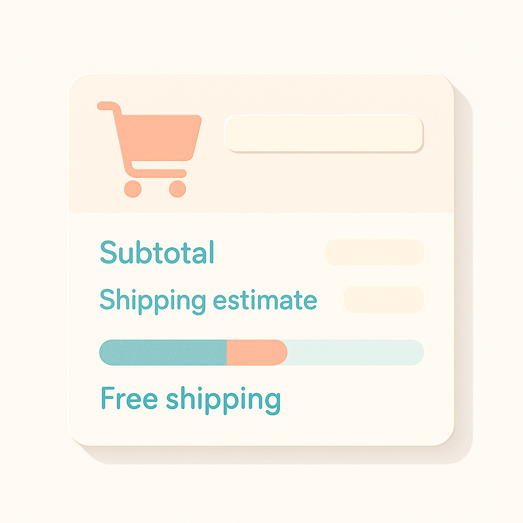
One of the biggest reasons for abandonment is a price gap—“it was more expensive than I expected.” In particular, if shipping or fees are only revealed at the very end of checkout, users are likely to feel “this is pricier than I thought” and leave. In Shopify, by editing your theme you can show the subtotal and an estimated shipping amount on the cart page or in the mini cart, and display messages like “Spend ¥X more for free shipping.” By setting expectations in advance, you can reduce “bad surprises” at the checkout step.
For example, one store had a very simple rule—flat‑rate shipping of ¥X and free shipping over ¥Y—but that information only appeared in small text near the bottom of the product page. As a result, users only noticed shipping after adding items to the cart and abandoned when they realized “I’m over budget once shipping is included.” In this case, the store added prominent shipping rules to the cart page and implemented a progress bar showing “Spend ¥X more for free shipping,” which improved the “reached checkout” rate. Even without changing the shipping rules themselves, simply adjusting where and how you communicate them can help curb cart abandonment.
On the other hand, setting the “free shipping threshold” too high or oversimplifying complex shipping conditions (by region, temperature control, etc.) can lead to complaints and cancellations. Especially during sales and campaigns, double‑check that your actual shipping policy and what is displayed on the site are not in conflict.
3. Remove anxiety with payment methods and trust signals
The worry of “is it really safe to buy from this site?” during checkout is another major cause of cart abandonment. Offering familiar payment methods such as Shopify Payments and PayPal reassures users that “payment looks secure.” From Settings > Payments in the Shopify admin, you can add and enable available payment providers, so prepare multiple options that fit your customer base.
Where you place trust information is just as important. A common mistake is to link to legal information (“Act on Specified Commercial Transactions”), and to your return and refund policies only from the homepage or footer, making them hard to reach from checkout. Customers often want to confirm returns and shipping right before purchase, so link to your policy pages with a single click from product pages, the cart page, and near the footer of your checkout as well to increase confidence.
You can also optimize how you showcase reviews and proof of track record. Some Shopify themes let you display representative reviews or proof such as “XX,000 units sold” on the cart page or in the mini cart. Use these to provide social proof—“other people are buying” and “orders are actually being delivered”—and ease last‑minute concerns. However, exaggerated claims or numbers that do not match reality will damage trust and should be avoided.
4. Minimize input fields and make errors easy to fix
If there are too many fields to fill in during checkout, users are more likely to get tired and drop off midway. This effect is especially strong on stores with many mobile purchases; even a single extra field adds noticeable friction. Depending on your theme, Shopify checkout can be customized to make the phone number optional, hide the company name field, and more. Systematically review each field to decide whether it is truly essential, and boldly remove non‑essential fields to lower the barrier to completion.
Just as important is how clearly you display errors. If, for example, a postal code format error or an incorrect card number only triggers a red error message at the top of the page, users may not understand what to fix and simply abandon the process. Aim for a design where error messages appear directly under the relevant field and colors or icons clearly indicate which fields are blocking progress, so users can instantly see “what to fix and where” to move forward.
A common real‑world case is where a store installs an address auto‑fill app, but due to incompatibility with certain postal code formats, errors occur frequently. Reviewing customer inquiries and payment error logs to see whether errors cluster around specific browsers, devices, or postal codes can help identify causes of abandonment. When you add a new app, do not just run a few test orders—monitor error counts over the next few days as well to make sure nothing has quietly broken.
5. Rework abandoned cart emails and reminders
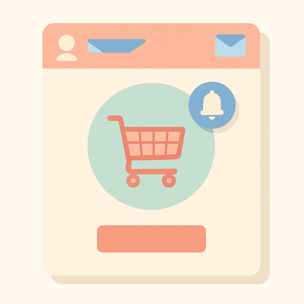
You do not have to assume “once a user leaves, they will never come back.” With Shopify’s Abandoned checkout feature, you can automatically send reminder emails to users who left during checkout. You can adjust the send timing and email body to match your store’s policy. Even a simple setup like “send one email after one hour” can recover sales that would otherwise be lost.
A frequent misstep is making “send an abandoned cart email with a coupon immediately” your default. This trains users to intentionally abandon their cart and wait for a coupon, which can severely hurt profitability. Start instead with a simple reminder email without a discount, aimed mainly at users who “were considering purchase but forgot after switching tasks,” and bring them back in a more sustainable way.
There is also room to improve subject lines and email content. If the subject line is vague or the sender name does not clearly match your store name, the email may never be opened. When editing Shopify’s notification templates, clearly state which products remain in the cart and how long the cart will be kept, so that when users return, they can resume purchase without confusion.
6. Improve the path from cart to checkout and your page speed
Cart abandonment can also happen when users stray to other pages mid‑flow and never find their way back. Typical patterns include returning from the cart to a product detail page, or opening a shipping policy in a new tab, then getting distracted by other sites. In these cases, it is critical that “Back to cart” and “Proceed to checkout” buttons are always visible and clear. Let users go to checkout in a single click from the mini cart, keep a cart icon visible in the header at all times, and design navigation so users do not get lost.
Page speed also affects cart abandonment. Use Shopify’s Online store speed report and page speed tools to check the performance of cart and checkout‑adjacent pages, and identify what is slowing them down. If the cart page loads multiple external scripts or widgets, some users may have to wait several seconds before they can click a button. Once perceived wait time exceeds 2–3 seconds, more users feel “the page froze” and leave, so consider limiting the cart area to only truly essential features.
A typical operational issue is that adding one analytics or personalization script after another gradually makes only the cart page extremely heavy. Whenever you add a new script or app, get into the habit of doing a quick speed check on the cart page to confirm that it does not feel slower. This lets you keep improving safely over time.
7. Use related product suggestions to boost add‑ons without hurting UX
When thinking about cart abandonment, people often focus on reducing the number of steps to completion, but improving the “quality of the cart experience” also matters. If you can present combinations that make customers feel “this is a good set to buy together,” you actually raise purchase intent and make users less likely to leave the cart. Depending on the theme, Shopify can show a standard “Recommended products” section on the cart page or in the mini cart, and you can configure related products that pair well with items in the cart, either automatically or manually.
But again, overdoing it backfires. If a big popup aggressively pushes add‑on products every time something is added to the cart, or if the mini cart is stuffed with a long list of items, users cannot focus on what they actually want to buy now and abandonment may increase. In fact, there are cases where oversized recommendation blocks increased scroll depth on the cart page and reduced the click‑through rate on the checkout button.
When offering related products, treat them strictly as “supporting information for the items under consideration.” Limit suggestions to items that clearly complement the current selection: discounted bundles, frequently bought‑together consumables, or size and color variations that feel genuinely useful to buy together. That way you can raise average order value and reduce abandonment in a balanced way.
How to apply this with RecoBoost
If you are using RecoBoost, you can implement related product suggestions around the cart while keeping them within a range that does not increase abandonment. For example, you can configure rules such as showing only one or two highly compatible items in the mini cart, or prioritizing recommendations in a price range that helps users reach the free‑shipping threshold. This helps you encourage add‑on purchases while maintaining a simple layout where the checkout button does not get buried. A realistic approach is to start testing minimal recommendations—carefully choosing placement and item count—on the devices with the highest abandonment (often smartphones), and then gradually refine toward the best‑performing pattern based on the data.
Cart abandonment is rarely caused by a single factor. It usually results from a combination of elements: how shipping is presented, payment methods, input forms, error handling, trust information, reminders, and navigation design. Instead of trying to fix everything at once, measure where users are leaving, then improve the highest‑impact points one by one. This makes it easier to claw back revenue without leaning on heavy discounting. Since you can do a lot with Shopify’s built‑in features and theme settings, start by making small, concrete improvements today.