
Playbook
Cart Cross-Sell Playbook You Can Launch Today
A practical playbook for adding cross-sells and upsells to your Shopify cart without feeling pushy. Breaks down placement, timing, pricing rules, and copy so you can test it in 30 minutes.
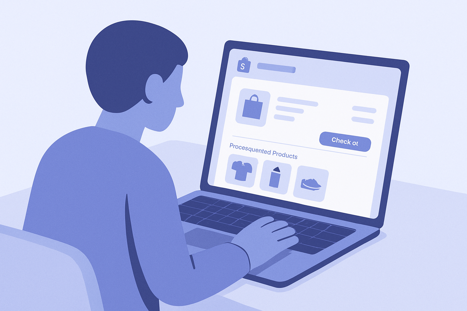
What You’ll Do With This Playbook (Bottom Line)
Cart cross-sells, if done wrong, increase cart abandonment. If you design them well, they turn your store into “a shop that takes care of the shopping experience.”
- Where to place cross-sells on the cart page: above or below the button, or in the sidebar
- When to show them: first visit, after quantity changes, above a certain cart value, etc.
- What price range to show: how high you go relative to the current cart value
- Copy that doesn’t feel pushy: patterns with bad and good examples
Here, all of the above is broken down into steps you can try in about 30 minutes today. At the end, you’ll also see a concrete first step for configuring this in RecoBoost.
Basics: 3 Rules to Follow for Cart Cross-Sells
- The hero of the cart is the checkout button: cross-sells are side characters, so they must not stand out more than the Proceed to checkout / Complete purchase button.
- Default angle is “prevent forgotten items”: choose items from the perspective of “things that are genuinely helpful for the customer,” not just profit.
- Don’t get greedy versus your average order value: aim to add just one item that increases the cart total by around 20–40%.
With these principles in mind, you’ll decide placement, timing, price range, and copy.
How-To: 5 Steps to Add Cross-Sells to the Cart Page
- 1. Check Your Current Cart UI in the Shopify Admin
- Go to Shopify admin → Online Store → Themes, and click Customize on the live theme.
- In the preview, open the Cart page and capture:
- Position of the checkout button
- Position of the order summary (subtotal, shipping, etc.)
- Empty space (both desktop and mobile)
Save this as screenshots or notes. - 2. Decide Candidate Positions for Cross-Sells
You have three main options:
- Right below the checkout button: most common. Doesn’t interfere with the button and still gets attention.
- Below the cart items, above the total: lets you suggest “add-ons” after the customer checks their items.
- At the bottom of the side cart (drawer): for themes using side carts. Show just 1–2 items above the footer.
For your first test, placing cross-sells right below the checkout button is recommended. It’s easy to notice without feeling pushy. - 3. Define When They Should Appear
Instead of “always on,” set conditions so cross-sells are less likely to cause abandonment.
Suggested combination:
- Show only when the cart value is above a threshold
- Example: if your AOV is ¥6,000, show when the cart subtotal is ¥3,000 or more.
- Very low cart values tend to feel like “one-and-done” purchases, so extra offers become noise.
- Emphasize them like a light popup only on the first session
- From the second time onward, show them quietly as a list.
- Show only products with at least a certain stock level
- Exclude items that sell out easily so the experience stays consistent.
If your app supports conditions, start with a minimum cart value rule, then refine later via A/B tests. - 4. Decide Your Price-Range Filters
To keep cross-sells from feeling pushy, first define “up to what price” you’ll show.
Guidelines:
- Limit to products priced within 30–60% of the cart total
- Cart ¥5,000 → around ¥1,500–3,000
- Cart ¥10,000 → around ¥3,000–6,000
- For higher-ticket categories (electronics, luxury, etc.), keep it to about 10–30%.
On top of that:
- Prioritize products closely related to the original item category
- Skincare → same-brand cleanser or mist
- Clothing → matching accessories or care items like hangers and brushes
- If you have a free-shipping threshold
- Example: free shipping from ¥5,000, combine with “You’re ¥○○ away from free shipping” and only show items within that gap.
Practically, use your app’s filters to specify both a price range and relevant collections (categories). - 5. Set Copy That Doesn’t Feel Like Hard Sell
Decide your cart cross-sell title and subtext based on these patterns.
Patterns to avoid
- “You’ll lose out if you don’t buy now!”, “This is an absolute must-buy!”, “Since you’re here, why not stock up?”
- Strong claims, commands, and fear-based messaging tend to increase abandonment.
Safe, easy-to-use patterns
- “Frequently bought together”
- “Items people often forget”
- “Recommended items that go well with ○○”
- “Items that make care and maintenance easier”
Subtext templates
- “Only add to your cart if you need it.”
- “Popular with customers who are just short of free shipping.”
- “A popular combo for first-time customers.”
To start, set the title to “Frequently bought together” and the subtext to “Only add to your cart if you need it.” Then track click-through rate and cart abandonment for 1–2 weeks.
Placement Tips: Think Separately for Desktop and Mobile
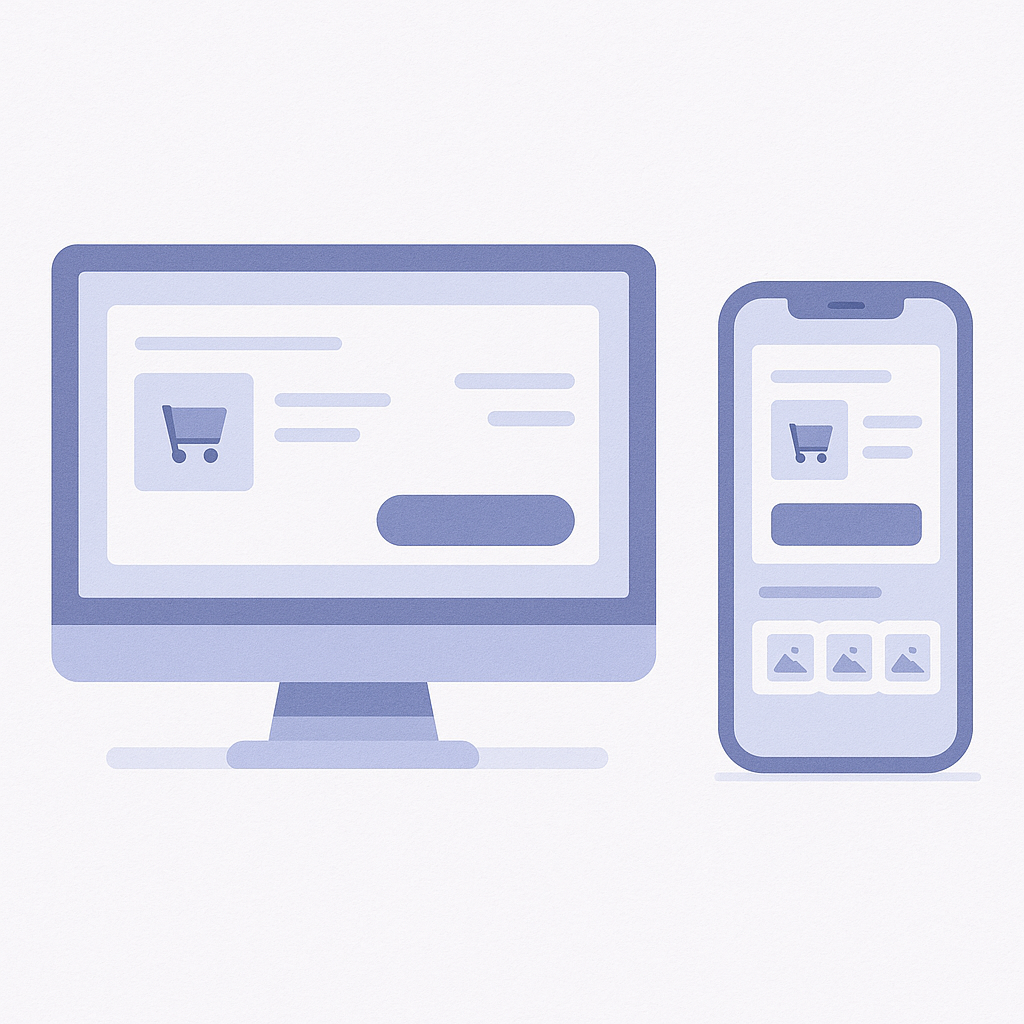
- Desktop: Use the Width and Show Up to 3 Products
- Place them in a 1-row, 3-column layout either below the cart items and above the checkout button, or just below the button.
- Each card should only have a small thumbnail, one line of product name, price, and an Add to cart button—no description text.
- Use more muted colors and styling than your main button (e.g., greys) so checkout remains the primary focus. - Mobile: Blend Into the Vertical Scroll
- Show only 1–2 items directly under the checkout button, and even with a “View more” link, cap it at 3 items.
- Each card is limited to thumbnail, product name, price, and a small button, keeping text to a minimum.
- An accordion pattern also works: collapse it under “View recommendations” and expand only for people who tap. - Shared Rules: Consistent Button Labels and Design
- Standardize the add button label as “Add to cart” (avoid “Buy now”).
- Match the color and wording to product-listing buttons elsewhere on your site.
- Keep discounts and badges (SALE, Best seller, etc.) to a minimum so it feels like a quiet suggestion.
Common Mistakes and How to Avoid Them
- Mistake 1: Showing a Popup Cross-Sell Every Single Time
- If you show a full-screen popup every time someone goes to the cart, mobile users in particular will drop off.
- Fix: limit popups to the first session only, or only when exit intent is detected (back actions, etc.), and otherwise use static blocks within the cart. - Mistake 2: Pushing High-Priced Upsells That Reset the Cart
- Example: in a ¥5,000 cart, aggressively pushing a ¥20,000 higher model often leads to “I’ll just skip it.”
- Fix: use cross-sells only for “additional” items. Handle upgrades to higher models on the product page or via dedicated popups. As a rule of thumb, keep cross-sell prices within 30–60% of the cart total. - Mistake 3: Showing Out-of-Stock or Partially Out-of-Stock Variants
- If you show items with many missing sizes or colors, customers are kicked to the product page and are more likely to abandon.
- Fix: in your app filters, target only products with stock above a set quantity. If variant-level stock can’t be checked, exclude frequently missing items using tags or similar. - Mistake 4: Cross-Sells Visually Overpower the Main Flow
- If cross-sell cards are large and very colorful, it feels like “they’re trying to make me buy more.”
- Fix:
- Make thumbnails and button colors more subdued than the main purchase button.
- Use light grey borders and backgrounds so the tone feels more like an informational notice.
Your Next Step With RecoBoost
If you’re using RecoBoost, you can map all of the above directly into your settings.
- In Shopify admin → Apps → RecoBoost → Layout settings, set the Display position to Cart page, directly under the checkout button.
- In RecoBoost → Recommendation settings, choose AI similar products or Frequently bought together for the logic, then use the price filter to specify a range equivalent to 30–60% of the cart total.
- In RecoBoost → Copy settings, set the title to “Frequently bought together” and the description to “Only add to your cart if you need it.”
- Every 1–2 weeks, check RecoBoost → Reports for “Additional revenue from cart cross-sells” and “Change in cart abandonment rate,” and then test, one by one:
- Display position (above vs. below the button)
- Price range
- Copy