
Shopify AOV Playbook: Where to Place Recommendations on PDP, Cart, Thank You
The fastest way to lift AOV on Shopify is to design what you recommend on which page. This guide maps effective recommendation layouts for PDP, cart, and thank you pages, with placement patterns, copy examples, common pitfalls, and how to implement them with RecoBoost.
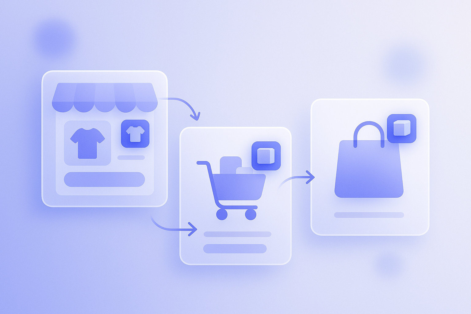
On Shopify, the quickest way to raise average order value (AOV) is not complex algorithms but deciding where recommendations appear, what they show, and in what order. The exact same recommendations can drive 2–3x more revenue simply by changing placement. Here, we focus on three locations – the PDP (product detail page), cart, and thank you page – and walk through how to build an AOV-focused recommendation layout map. All examples are concrete enough to implement tomorrow via theme editing.
The core idea: assign clear roles to each page. On PDPs, use related products to create bundles. In the cart, use upsell to suggest a higher tier. On the thank you page, plant ideas that trigger the next purchase. Give each page a single objective and avoid stacking too many recommendation blocks. That is the basic approach to lifting AOV.
Why recommendation placement changes AOV
Recommendations are not just about what you show; timing and placement change results dramatically. For example, showing four related products right under the first view of a PDP versus listing the same four at the very bottom produces very different click and add-on rates. In many stores, recommendations stay buried at the bottom of the PDP and simply never enter the customer’s field of view.
AOV is “order value ÷ number of orders,” so you need paths that increase either units per order or price per unit. Recommendations are a classic way to do that, but they only work if they match the shopper’s mindset on each page. On PDPs, customers are comparing what to buy. In the cart, they have already decided to purchase. On the thank you page, they have just purchased and feel satisfied. Each of these states calls for a different type of suggestion.
A common real-world mistake is showing the same “Recommended products” with the same logic on every page. On the PDP this interrupts product comparison, and in the cart it distracts from checkout, so in the end none of the recommendation blocks get clicked. The first step to raising AOV is to define one clear purpose per page and design placements around that.
PDP: Use related products to create natural bundles
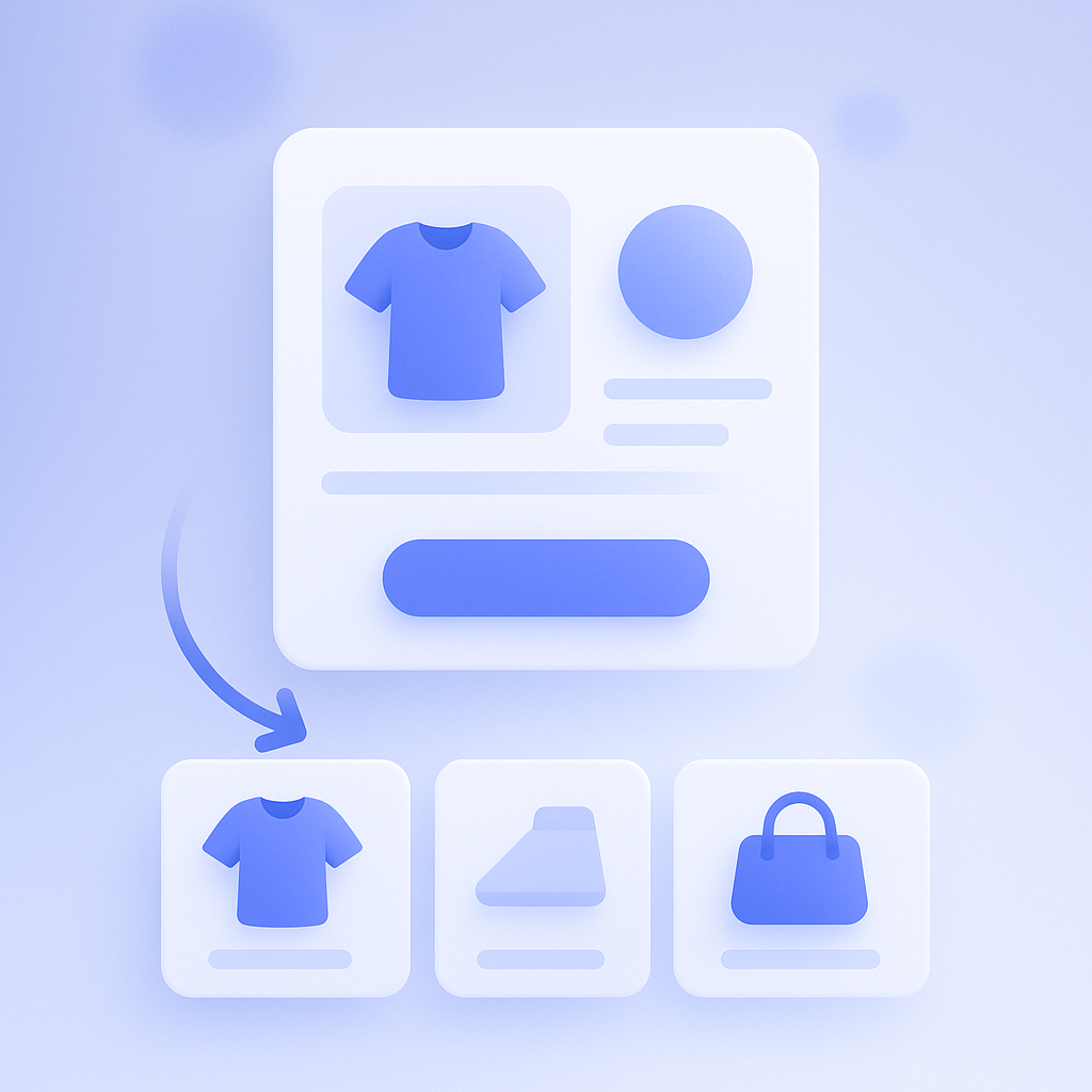
The PDP’s job is to help the customer decide whether to buy this item. At that moment, the most effective recommendation type is related items that are used together for the same purpose (cross-sell). For skincare, that could mean showing lotion PDP visitors a matching emulsion or serum. For apparel, showing bottoms or outerwear on a tops PDP. Design it so that 2–3 items per product are naturally bought together as a set.
As a rule of thumb, place the block either right under the product description/overview or right above the reviews. If you put a big recommendation block directly under the first view, other products appear before the main information, which can cause users to bounce. If you bury it in a tiny block at the bottom, almost no one scrolls that far. Safest is to place a single block where it naturally comes into view after the customer has read through the product information.
Make the copy clearly convey “bundle buying.” For example: “Frequently bought together with this item” or “Staff-recommended bundles.” Generic lines like “Recommended for you” do not explain why items are shown and tend to depress click-through. On the other hand, if you mix in low-relevance clearance items, the logic behind the bundle becomes unclear and trust drops. On PDPs, commit to showing only items that are genuinely convenient to use together.
Cart: Use upsell to quietly suggest a higher tier
The cart page’s role is to move customers into checkout. They already have items in the cart, so intent to buy is higher than on the PDP. At this point, upselling to a higher size, bundle, or price tier and light cross-selling to prevent “forgotten items” both work well. But the top priority is not disrupting the path to the payment button.
The standard layout is a single block placed under the cart item list and slightly below the order total. If you put a large recommendation section at the top of the cart, it becomes harder to see what is already in the cart, which makes some customers uneasy and more likely to abandon. In the cart, prioritize showing “current contents,” “shipping thresholds,” and “order total,” and let recommendations appear as a natural continuation of that flow.
Patterns that tend to perform well in the cart include:
- Suggesting a larger size or multi-pack of the same item (for example, 10–15% cheaper than buying singles)
- Showing only 1–3 staple items from the same category as the items already in the cart
- Suggesting low-priced items that help customers reach the “Spend ¥X more for free shipping” threshold
A frequent failure pattern is showing about as many recommended items as there are items in the cart. The cart then feels flooded with recommendations and it is hard to tell what the customer actually meant to buy. Another pitfall is displaying discount banners, coupon fields, and recommendations all at once, which scatters attention and drags down CVR. In the cart, think of recommendations as “one small push to nudge AOV up” and strip other functions back accordingly for stability.
Thank you page: Plant seeds for the next purchase
On the thank you (order confirmation) page, the purchase is already complete, so you cannot expect add-on orders at the same level as PDPs or carts. Instead, treat recommendations here as a way to leave ideas for the next purchase and thereby lift AOV over the medium to long term. Design this section assuming you will later follow up with email marketing or retargeting ads.
By default, place a single block under the order summary or below the shipping information once all essential details have been shown. Customers visit the thank you page primarily to confirm whether their order went through, so the recommendation block must not interfere with that. You also do not need cart-level click-through from this block; it is enough that it catches the eye. That mindset makes it easier to balance the page.
On the thank you page, it often works better to prioritize “what they are likely to buy next” rather than “what goes with this order.” If you have everyday items customers repurchase regularly, line up those staples here. Suitable copy might be “Recommended for your next order” or “Popular repeat purchases,” phrasing that evokes “next time” rather than “right now.” If you add a limited-time coupon, keep it compact and place it just above or below the recommendations to avoid turning the page into a wall of banners.
How to build your page-by-page recommendation layout map
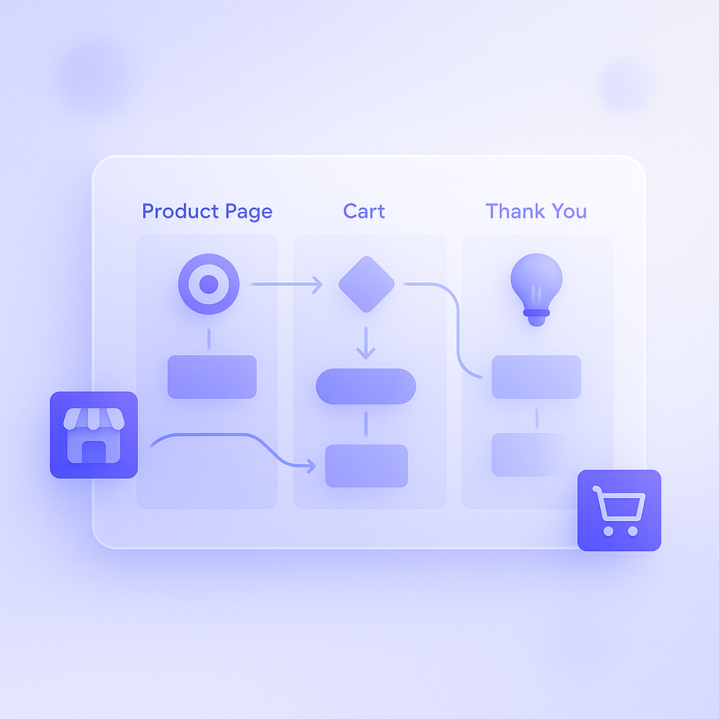
To turn everything above into something usable in day-to-day operations, first create a one-page “page-by-page recommendation layout map” for your own store. A simple spreadsheet or notebook is fine. For each of the PDP, cart, and thank you pages, write down the objective, placement, logic, and copy. This gets you out of the default state of “just using whatever the Shopify app shows by default.”
For example, a simple table might look like this:
- PDP: Objective = drive bundle purchases / Placement = under product description / Logic = products related to the one being viewed / Copy = Frequently bought together with this item
- Cart: Objective = upsell to a higher tier / Placement = under cart item list / Logic = higher-grade or bundled versions of cart items / Copy = Save more when you buy in a bundle
- Thank you: Objective = trigger next purchase / Placement = under order details / Logic = high-repeat staple products / Copy = Recommended items for your next visit
Creating this map once before implementation helps you catch overlaps and excesses such as “using the same copy on PDP and cart” or “showing cross-sell and upsell together in the cart.” When you later add or remove recommendation blocks in your Shopify theme, it also makes it easier for the team to share which objective each block owns, reducing ad hoc, unplanned changes.
How to put this into practice with RecoBoost
When using RecoBoost, start by deciding your page-by-page recommendation layout map as outlined here, then link each widget to a specific role. For the PDP, create a single “related products” recommendation and fix its placement under the product description. For the cart, create a single “upsell” recommendation and place it under the cart item list. For the thank you page, prepare a separate “repeat purchase” recommendation with its own logic. Even without advanced A/B testing at the start, simply setting up these three role-based placements will stabilize your AOV baseline and make subsequent optimization much easier.
In summary, designing recommendations with distinct roles on the PDP, cart, and thank you pages makes AOV improvement opportunities suddenly visible. On PDPs, aim for bundle purchases; in the cart, gently upsell to a higher tier; on the thank you page, seed the next order. Assign one objective per page and place a single recommendation block to match. Start from this simple layout map and then fine-tune one area at a time based on results for a realistic, repeatable path to growth.