
Designing effective cross‑sell in the Shopify cart without hurting checkout
To make cross‑sell work on your Shopify cart, you need to design where it appears, what it shows, how many items, and how it’s worded. This article breaks down layout, recommendation logic, and UI patterns that raise AOV without increasing cart abandonment, including examples and common failure
It is not unusual for cross‑sell products shown on a Shopify cart page to get almost no clicks. In many cases, the reason is that the store just throws in some popular items without designing the placement or the recommendation logic. Because the cart is a critical screen right before purchase, getting it wrong can increase abandonment instead of lifting average order value. This article breaks down the core design of cart cross‑sell on Shopify – placement, logic, and copy – to a level you can apply directly in day‑to‑day operations. The bottom line: treat the cart’s primary purpose as getting the customer to proceed to checkout, and within that constraint suggest only one to three highly relevant items so they do not get in the way. At the end, there is also a brief note on how to think about this when using the AI recommendation app RecoBoost.
Basic patterns for showing cross‑sell on the Shopify cart
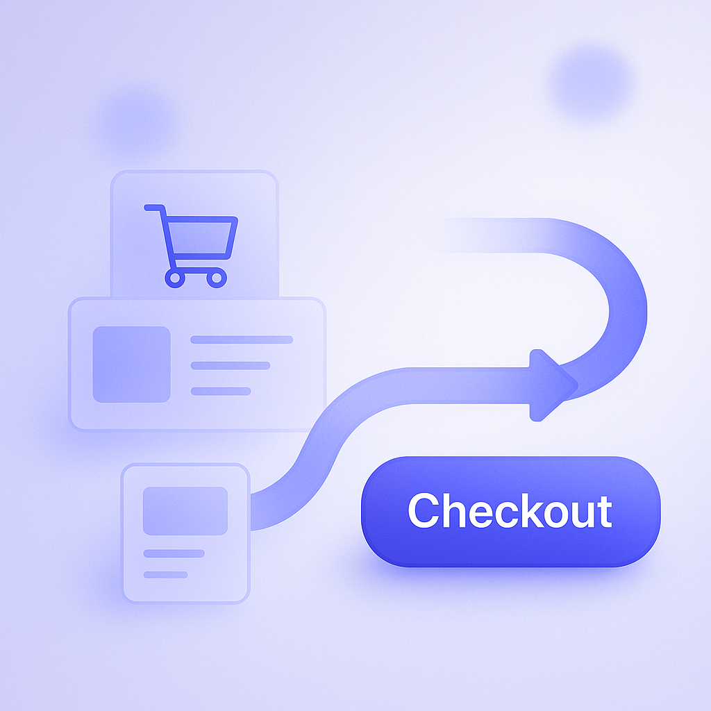
First, let us整理 the typical patterns for displaying cross‑sell on a Shopify cart. Broadly, there are two types of UIs: a dedicated cart page, and a drawer (slide‑out) cart. How you place cross‑sell will differ depending on which you use, and some themes use both. In most Shopify themes it is common to insert a product list below or beside the cart contents using sections or app blocks.
Three placement patterns are especially common. Pattern one is a four‑product grid displayed directly below the cart item list. Pattern two is a horizontal carousel of several items on the right side or bottom of a drawer cart. Pattern three is a narrow vertical list of just one or two products directly under the cart items as a set suggestion. None of these is universally correct; you need to choose based on screen height and the position of the checkout button. Avoid any layout where the order total or checkout button gets pushed out of view in the first viewport by cross‑sell content.
The number of cross‑sell items you show also matters. If you line up ten or more products, people are overwhelmed by choice and often respond less because they do not know what to pick. For many stores, limiting cart cross‑sell to two to four products makes both click‑through and add‑to‑cart rates more stable. In stores with a high mobile share, consider capping it at around three items in a horizontal carousel so it fits naturally on small screens.
Three placement rules you must follow for cart cross‑sell
The cart’s original role is to let customers review their order and feel reassured. If cross‑sell is too aggressive, people feel they are being hard‑sold and are more likely to abandon. To prevent that, anchor yourself on three placement rules. First, always give visual priority to the checkout button. Second, keep cross‑sell within a single screen where possible. Third, place it along the same line of sight as the cart contents.
It is common to see examples where the first viewport is packed with cross‑sell and the checkout button is pushed off the screen. In those cases, even if average order value rises in the short term, the overall completion rate can drop and total revenue ends up lower. For instance, if AOV rises 5% but conversion drops 10%, your revenue declines. When you run A/B tests on your cart, you must always look at both AOV and purchase completion rate together.
For the line of sight, the basic idea is to place cross‑sell where it does not interrupt the vertical flow of cart items → order total → checkout button. In practice, it is easier to manage if you visually group the total and checkout button as one block, and place cross‑sell immediately below that. For a drawer cart, show a horizontal recommendation carousel right under the checkout button and keep the tone to a light “How about adding one more item?” so it feels natural.
Designing cart recommendation logic: deciding what to show
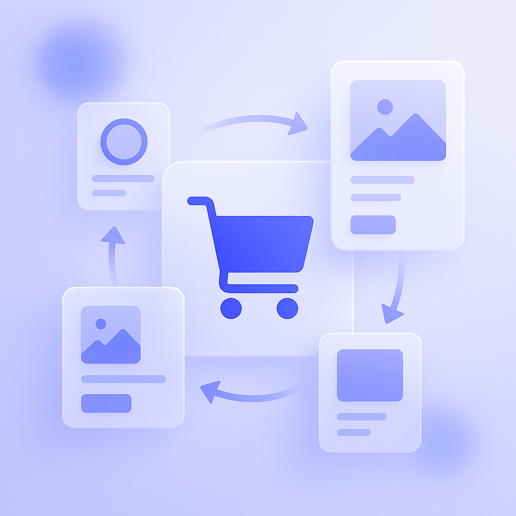
Once placement is decided, the next crucial piece is the recommendation logic – what you show. Shopify officially provides the product recommendations API and theme‑level related products features. These return items such as “frequently bought together” or “recommended based on browsing history,” which themes and apps can use. However, if you rely on them as‑is, you may end up surfacing popular items that are only weakly related to what is in the cart, so how you combine and constrain the logic matters.
Common cart cross‑sell logic falls into three broad types. First is related products to items in the cart, such as accessories and consumables. Second is threshold‑based upsell tied to cart total, for example “Spend ¥X more to get free shipping.” Third is items in the same category at a similar price point. The first type, related products, tends to work particularly well because it prompts customers to remember things they genuinely need, without feeling pushy.
A frequent failure mode is “just show the best‑seller ranking.” If the cart is full of skincare but your ranking shows top‑selling appliances, the low relevance means customers will simply ignore them. If click‑through drops below about 1%, you likely need to revisit relevance. In smaller stores where you lack enough data, it is fine to start with simple rules like “If product A is in the cart, show product B.” Even predefining three to ten product pairs based on common set purchases or staff intuition about what goes well together will often outperform random or generic displays.
Copy and UI for cross‑sell: how to suggest without disrupting the purchase
Even with the same products, performance changes drastically depending on copy and UI. On the cart page, customers are in “final review” mode, so a tone that supports checking their order generally works better than hard‑sell promotional copy. Instead of shouting “Recommended” or “On sale,” use descriptive phrases like “Frequently bought together” or “Items often used to care for this product,” which are easier to accept in that context.
On the UI side, cross‑sell cards tend to perform better if they include, in addition to product name, price, and thumbnail, a variation selector and an add‑to‑cart button where possible. If customers have to go to the product page before they can add the item, you introduce extra taps and risk losing them midway. That said, making customers choose among many variations inside the cart only creates hesitation, so exclude complex items from cross‑sell and focus on simpler ones such as products with a single size and two or three colors.
You might consider banners or pop‑ups for cross‑sell, but near‑full‑screen pop‑ups on the cart can reduce completion rate. This is especially problematic on mobile where close buttons are harder to tap and quickly become a source of frustration. For cart cross‑sell, a small, persistent block that quietly suggests items is usually the right level of emphasis. Even when you want to highlight a campaign, start safely with a slim banner or short text at the top of the cart rather than an intrusive modal.
Learning from examples: cross‑sell that works and cross‑sell that fails
A classic successful example is a cosmetics store offering a “cleanser + cotton pads + trial pack” combination. When a customer adds a cleanser to the cart, two items – cotton and a trial pack – appear at the bottom of the cart under the heading “Frequently bought together.” Because the items are highly related and relatively affordable, add‑to‑cart rates can reach 10–20%. The more a product category naturally lends itself to set purchases, the more effective this type of “missing one item” cross‑sell becomes.
On the other hand, a common failure is a large recommendation block crammed under the cart and filled with sale items. When you highlight deep discounts and line up ten or more products, customers feel they are being pushed to buy more than they really need and may decide to stop and rethink the entire purchase. Clearance items also often have low relevance to the existing cart contents, which further depresses click‑through. If you mix sale items into cross‑sell, limit them to products that share a similar category or use case with what is already in the cart to avoid dissonance.
Another failure pattern is an overly complex free‑shipping threshold upsell. For example, showing multiple overlapping conditions like “Spend ¥X more for free shipping” plus “Buy one more item from this category to get Y% off” quickly becomes too hard to calculate, and customers no longer know what to buy, or how much, to get the best deal. When you use a free‑shipping threshold, narrow the message to something like “¥X more for free shipping” plus “Suggested extra item,” and show only one to three items in the cross‑sell block that satisfy that condition so it is easy to understand and act on.
How to leverage RecoBoost: let AI own the logic while you focus on design
When you use an AI recommendation app like RecoBoost, your operation will be much smoother if you decide upfront what data to use and what to prioritize. On the cart page, for example, you can base recommendations on “frequently bought together” while also factoring in stock levels, profit margins, and the categories of items in the cart. The store side can then focus on the design decisions covered in this article – placement, number of items, copy, and which products to exclude, such as those with many variations – and leave the具体的 selection of products to RecoBoost. This way, even when your lineup or best‑sellers change, you reduce the need to constantly redo manual cross‑sell settings while keeping cart suggestions highly relevant over time.
Cart cross‑sell is a powerful lever for raising average order value, but it also carries the risk of lowering purchase completion. Start by prioritizing three basics: do not block checkout, show a small number of highly relevant items, and use clear, easy‑to‑grasp copy. Begin small and tune based on data. Even when you leverage AI recommendations, sticking to this basic design gives you a stable foundation for cart recommendations that keep working in the long run.