
A Practical Playbook for Ranking Recommendations on Collection Pages
A practical playbook for placing “ranking” recommendations on Shopify collection pages without breaking category context, using native features, theme tweaks, and RecoBoost.
Conclusion: Keep rankings within the same collection, placed only at the bottom or in the sidebar
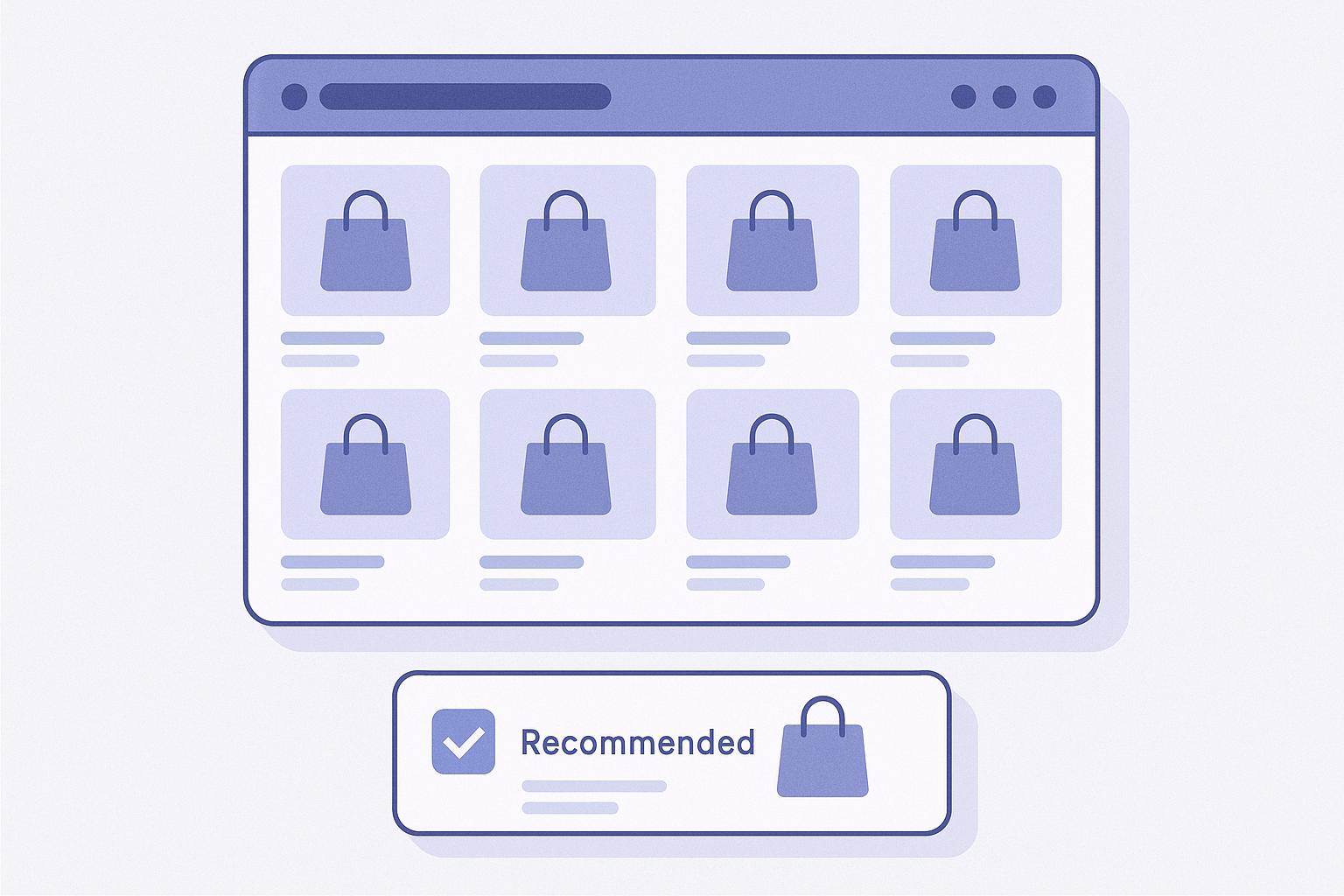
For rankings on collection pages, the basic rule is to show “best‑selling or top‑rated products within the category the user is currently viewing.” If you place this either below the collection or in the sidebar, you can boost browsing and add‑to‑cart rate without breaking the category context.
This article breaks things down into “you can start today” steps, in this order: using standard Shopify features, using theme customization, and finally an example using RecoBoost.
First, decide where and what kind of ranking you’ll show for each collection
- Decide which collections to target: Start with collections that already generate significant revenue or traffic. For example, a New Arrivals collection or a Women’s Tops collection.
- Limit your ranking to a single axis: In most cases, use either “order of units sold” or “order of review score.” If you mix multiple axes, users can’t easily understand why a product is ranked where it is.
- Decide the range of the ranking: Keep it strictly within that collection. If you mix in products from other collections, the category context breaks and users are more likely to feel “this isn’t what I was looking for.”
- Decide how many products to show: If mobile is your main traffic, aim for 3–5 items; if it’s a PC sidebar, around 5–10 items is a good benchmark. Overly long rankings easily turn into “lists people don’t read to the end.”
Once these basics are set, move on to the actual placement work.
Steps: How to place rankings on collection pages (within today’s scope)
Below, the flow is split into two parts: a simple “pseudo‑ranking” using theme editing, and a flow that assumes a recommendation app. Details vary by theme and app, but the core tasks are the same in any setup.
- In the Shopify admin, go to Collections and choose the target: Open Shopify admin → Products → Collections and select the collection where you want to display the ranking (e.g., Summer Dresses). Take note of the URL or handle; it will be handy when you set up conditions on the theme side.
- Open Shopify admin → Online Store → Themes → Customize: In Shopify admin, go to Online Store → Themes, click Customize on the theme you use, and select the Collection template from Templates. In the preview, picture where you want the ranking (below the product grid or in the sidebar).
- Add a section and create a block for the ranking: In the right‑hand list of sections, click Add section and choose a block your theme provides, such as Featured collection, Custom liquid, or Custom HTML. Give it a ranking‑specific title that reflects the collection context, such as “Popular items in this category.”
- Restrict ranking targets to the current collection: In the section settings, if you can choose a product source, limit it to This collection or Current collection. If you build the ranking as a separate smart collection, set its sort order to Best selling and then load that collection into the ranking section.
- Limit the number of products displayed: If the section has a setting for number of products, set it to around 4 when mobile is your main traffic. Instead of adding a “View more” link, aim for a feel of “showing only the carefully selected top items,” which tends to stabilize click‑through rates.
- For desktop, consider using the sidebar: If your theme has a Sidebar or Supplementary section, consider placing the ranking in the desktop sidebar and showing it only below the product grid on mobile. In the theme’s device display settings, check whether you can toggle visibility separately for desktop and mobile.
- Rewrite copy to make it clear this is a ranking: Set the section heading to something like “Best‑selling ranking (this collection)” and, if your theme lets you add body text, add a short line such as “Products are ordered by popularity within this category.” Explicitly explaining the order makes clicks more likely.
- Check both mobile and desktop in the preview: Use the device switcher in the top right of the theme editor to check smartphone, tablet, and desktop views. Confirm where in the scroll the ranking appears and whether the product cards have become too small.
- Before publishing, confirm it only applies to the intended collections: If you duplicated templates, go to Templates → Collection and confirm that the “with ranking” template is linked only to the target collections. Also quickly preview other categories to make sure odd‑looking rankings aren’t showing there.
Placement tips: Bottom vs. sidebar, and how to keep context intact

- On mobile, place it directly below the product grid: The natural flow is to show the ranking after users finish scanning the product list so they can then see “what’s popular.” Placing it roughly just above the footer keeps scroll length reasonable.
- On desktop, consider a two‑layer setup with right sidebar plus bottom: Place a sidebar ranking (top 3–5 items) to the right of the product grid, and a more detailed ranking at the bottom of the page so popular items catch the eye even mid‑browse. Just be careful not to cram the sidebar so much that the main content area feels too narrow.
- Always make the category context explicit in the title: Don’t just label it “Ranking.” Use a title such as “Popularity order in this collection” or “Best sellers in the [Category] category” to clearly tie it to the page the user is currently viewing.
- Avoid letting price range or style get too scattered: If the ranking skews so that only high‑priced items line up, or only sale items appear, it can drift away from the collection’s intended feel. When needed, adjust filter conditions such as “best sellers within this collection in a certain price band.”
- Always include an Add to cart button in the ranking area: To make the ranking work as an actionable choice rather than just information, include Add to cart or View details buttons on the ranking cards as well. If every click takes users away to another page, you simply create more points where they can drop off.
- Limit rankings to one block per collection: Multiple separate rankings on the same page make users unsure which one to rely on. Even if you want to show both “best sellers” and “top‑rated,” keep to a single block—either pick one axis or use a tabbed UI within one ranking area.
Common pitfalls and how to avoid them
- Mistake 1: Showing the same ranking across all collections
- Problem: If every collection shows the same “shop‑wide bestseller ranking,” the category context breaks and products outside the genre users are now exploring get mixed in.
- Fix: Limit the ranking target to the Current collection. If you must show a site‑wide ranking, keep it for the home page only. - Mistake 2: Rankings rarely update and become fixed
- Problem: If the order stays the same for months, repeat visitors lose interest and start to feel “it’s always the same items.”
- Fix: Use Best selling or Recently popular conditions so the list updates automatically. If you manage rankings manually, define an update cadence, such as once a month, and bake it into your team’s routine tasks. - Mistake 3: The ranking block takes over the first view
- Problem: If the very top of the collection is a ranking, users can’t get an overview of the category. You unintentionally weaken the original purpose of the collection.
- Fix: Place rankings only below the product grid or in the right sidebar. Reserve the first view for the category’s visual identity and key or new products. - Mistake 4: On mobile, the ranking is so long users can’t reach the footer
- Problem: If you list 10 or more items in a mobile ranking, the page becomes uncomfortably long and footer links (guides, legal pages, etc.) become harder to reach.
- Fix: On mobile, limit it to 3–5 items. If you want to show more, create a separate collection page for the ranking and link to it via a “View more” link. - Mistake 5: Image ratios and card design differ from the main grid
- Problem: If the ranking section uses different image ratios or very different text layouts, it hurts the visual consistency of your brand.
- Fix: Reuse your theme’s product card design settings and apply the same card style used in the main grid wherever possible. At minimum, make sure image ratios and font sizes match.
Next step with RecoBoost: Switch to AI rankings that preserve collection context
If you want to move beyond manual control or the theme’s basic Best selling sort, you can use RecoBoost’s ranking logic to keep the collection context while updating automatically. Once installed, configure at least the following for stable day‑to‑day operation.
- In Shopify admin, go to Apps → RecoBoost: From Shopify admin, click Apps → RecoBoost to open the app’s management screen.
- In recommendation settings, choose a ranking‑type logic: From Recommendation settings, add a new widget and choose Ranking or Popular products (names vary by configuration) as the logic. If there is an option for “in‑collection ranking,” enable it here.
- Specify the display position as collection page bottom or sidebar: In the Display position settings, select Collection page and choose either Below product list or Sidebar. If theme integration is required, follow the guide to go to Themes → Customize and add a RecoBoost section.
- Set target collections and the number of items: In RecoBoost, specify the target collections and set the number of items based on mobile—around 3–5. If needed, adjust the priority among signals like sales, views, and add‑to‑cart events that drive the ranking.
- Use A/B tests and click‑through data to fine‑tune titles and counts: Check click‑through rate and revenue contribution in RecoBoost reports and tweak the ranking title and item count. In some shops, “Popular items in this category” will outperform “Bestseller ranking,” so test copy variations over a few weeks.