
Design Checklist for Adding “Complete the Look” to Product Pages
Adding a “Complete the Look” block to your Shopify product pages can raise AOV and reduce returns. This playbook gives you concrete steps and a checklist for which products to show, where to place them, and how to present them, plus how to test it quickly with RecoBoost.
Goal of this playbook
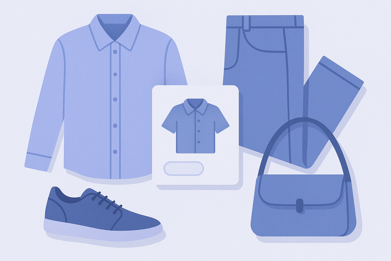
The goal of this playbook is to get you to a point, today, where you have a concrete design for adding a “Complete the Look” block to your product pages – a section that proposes all the items used in the outfit or setup.
Here, “Complete the Look” means a block that shows the main product together with items that “complete the outfit when bought together.” It is especially aimed at merchants in apparel, fashion accessories, furniture, interiors, and others who are searching for “Shopify outfit recommendations” or similar.
Before you start: decisions to make before placing Complete the Look
- Decide which categories will use it: Will you roll it out on all products, or start with core categories like “tops only” or “sofas only”? To keep operations simple, begin with categories where stock levels are stable.
- Define the relationship between the hero and coordinating items: For example, Tops → Bottoms / Outerwear / Accessories, Sofas → Rugs / Cushions / Tables. Roughly write out your brand’s “standard coordination” patterns in words.
- Set rules for handling stock and variants: For products that frequently have missing sizes or sell out quickly during sales, decide in advance whether to exclude them from Complete the Look.
- Check consistency of product images: Make sure the combinations you want to feature in Complete the Look are actually visible in product photos (on-model shots, use examples). If you recommend combinations that aren’t shown in images, you risk making customers uneasy.
Steps: designing your Complete the Look block

- 1. Group target products into Shopify collections
In the Shopify admin, go to “Products” → “Collections” and organize the main and coordinating product groups, such as “Tops,” “Bottoms,” etc. Clarify which collections contain the candidate products you want to surface in Complete the Look. - 2. Define only 3–5 representative outfit patterns
On paper or in a note app, list your most common coordination patterns. For example:
- Hero: Top → Bottoms + Outerwear + Accessories
- Hero: Dress → Outerwear + Bag
- Hero: Sofa → Rug + Cushions + Side table
Narrow this down to 3–5 patterns you can say “this is the default shape for most products.” - 3. Standardize the heading copy into 1–2 patterns
Unify the heading text shown on the product page. For example:
- “Complete the Look | Items used in this outfit”
- “Frequently bought with this item”
Ideally, use a single pattern per site so customers immediately understand what the block is. - 4. Decide where on the product page to place it
In the Shopify admin, open “Online Store” → “Themes” → “Customize,” then open the product template you want to edit. Decide candidate positions such as:
- Right under the product images
- Under the product description
- Above the reviews
Then check scroll depth on both desktop and mobile. In many cases, placing it between the product description and the reviews strikes a good balance between visibility and not being intrusive. - 5. Decide how many items to show
Set the number of items shown in Complete the Look. A good benchmark is 3–4 items.
- With 2 or fewer, it can look like a generic recommendation block
- With 5 or more, the information feels heavy and can overwhelm mobile screens
Start with 3 items, and only go up to 4 if needed. - 6. Choose the cart interaction style
Decide, in your implementation or app settings, which of the following you’ll use:
- A separate “Add to cart” button for each item
- Checkboxes for multi-select + a single “Add selected items to cart” button
Choose based on ease of use on mobile and what your theme or app can support. - 7. Define when the block should be hidden
Decide ahead of time whether to hide Complete the Look in situations like:
- When only low-stock products qualify
- On sale or outlet product pages
- For products that are already sold as bundled sets
If you clearly define “don’t show it under these conditions,” later adjustments become much easier. - 8. Pick 3–5 test product pages and review them
Select 3–5 actual product page URLs and check the following on both desktop and mobile:
- Does the heading copy feel natural?
- Do the recommended products clearly look “used together” when you see the images?
- Is the scroll position not too deep?
If needed, temporarily turn off Complete the Look for specific products while you fine-tune.
Checklist: must-check items before going live
- Is the target category clearly defined? You have decided which product categories will show Complete the Look.
- Are the hero-and-coordination patterns defined? Internally you can explain a pattern like “Top → Bottoms + Outerwear” as a standard template.
- Is heading copy unified? You are not mixing labels like “This outfit” and “Recommended items” from product to product.
- Is placement consistent? You have standardized the location across products, for example “under the product description.”
- Is the number of items kept to 3–4? You have checked on mobile that it doesn’t feel cramped.
- Is the cart interaction easy to understand? It’s immediately clear whether items are added one by one or all at once.
- Are rules for out-of-stock items defined? You have a clear policy for whether to display or hide items that are out of stock.
- Is there no overlap with existing bundles? Your bundles and Complete the Look are not competing with each other.
- Do images clearly convey the coordination? Customers can confirm the combinations shown in Complete the Look in the product photos as well.
- Have you checked both desktop and mobile views? You have reviewed scroll depth and button tapability on real devices or in preview.
Placement tips: balancing revenue and experience
- Order items to tell the “outfit story”: Instead of price or newest-first sorting, arrange by visual flow. For a top as hero, ordering Bottoms → Outerwear → Accessories in the order you would get dressed or look at them makes it easier to understand.
- Keep prices from overshadowing the hero: If you only line up items that are far more expensive than the hero, the whole Complete the Look block can feel pricey. Center the selection around the same or slightly lower price range, and at most add one high-ticket item for balance.
- Avoid products with few or no reviews when possible: Pushing items with zero reviews can create anxiety. Prioritize products with more reviews in Complete the Look to maintain a sense of reassurance.
- Check how many items fit into one mobile screen: Aim for 2–3 cards per screen on mobile. If only 1 fits, scrolling becomes tedious; if 4 or more fit, each card gets too small. Adjust your theme’s card width and the number of items shown.
- Intentionally include partial-look suggestions too: In addition to full head-to-toe sets, mix in lighter combos like “Top + Accessories.” This makes it easier for customers who think “I won’t buy the whole look, but I might add one piece” to take action.
Common pitfalls and how to avoid them
- Mistake 1: Low-relevance items appear
Example: A bag with a totally different color and style shows up on a top’s product page.
Fix: For Complete the Look, pre-limit which collections can be combined with each category. Even when using AI or automatic logic, restricting the base collections reduces off-target suggestions. - Mistake 2: The same items appear everywhere and feel stale
Example: No matter which product page you view, the same bottoms and the same bag always appear.
Fix: If sales or stock are heavily skewed, define several “secondary hero” items specifically for Complete the Look and rotate them. Having a seasonal rotation rule also works well. - Mistake 3: Too much information and the hero gets buried
Example: The Complete the Look block is longer than the main product section and makes scrolling tiring.
Fix: Keep it to 3–4 items, remove extra text, and trim product titles so they fit on a single line, minimizing information per card. - Mistake 4: Mostly recommending out-of-stock items
Example: The lineup is full of items the customer likes but hardly any sizes are left.
Fix: Set rules such as “only show items with stock of X or more” as a condition for Complete the Look, and choose apps or logic that can enforce it. For manual operations, run a weekly check to remove low-stock items. - Mistake 5: English-only text is unclear to customers
Example: Many customers don’t understand what “Complete the Look” means on its own.
Fix: Always add Japanese support text. For instance, use “Complete the Look|このコーデに使ったアイテム” with both English and Japanese, or switch to Japanese-only copy.
Next step with RecoBoost: use AI to auto-suggest coordinating items
With the Shopify app RecoBoost, you can automatically generate “Complete the Look” outfit suggestions on product pages using AI similarity and sales data.
You can try this today with the following steps:
1. From the Shopify admin, go to “Apps” and install RecoBoost.
2. Open RecoBoost and, under “Recommendation settings,” choose the AI coordination logic (for example, a rule that specifies which categories pair with the hero product).
3. On the product template where you want Complete the Look, use “Add section” to insert the RecoBoost recommendation block and set its position (such as under the product description).
4. Open 3–5 test product pages and check the suggestions, placement, and item count before publishing.
From there, the AI will keep automatically recommending items that “complete the outfit when bought together,” even as you add new products or stock levels change.