
How to Place Recommendations to Raise AOV on PDP, Cart, and Thank You
To raise AOV on Shopify, decide what to recommend on which page, and split roles across PDP, cart, and thank you. This post gives concrete placement steps and checklists you can try today.
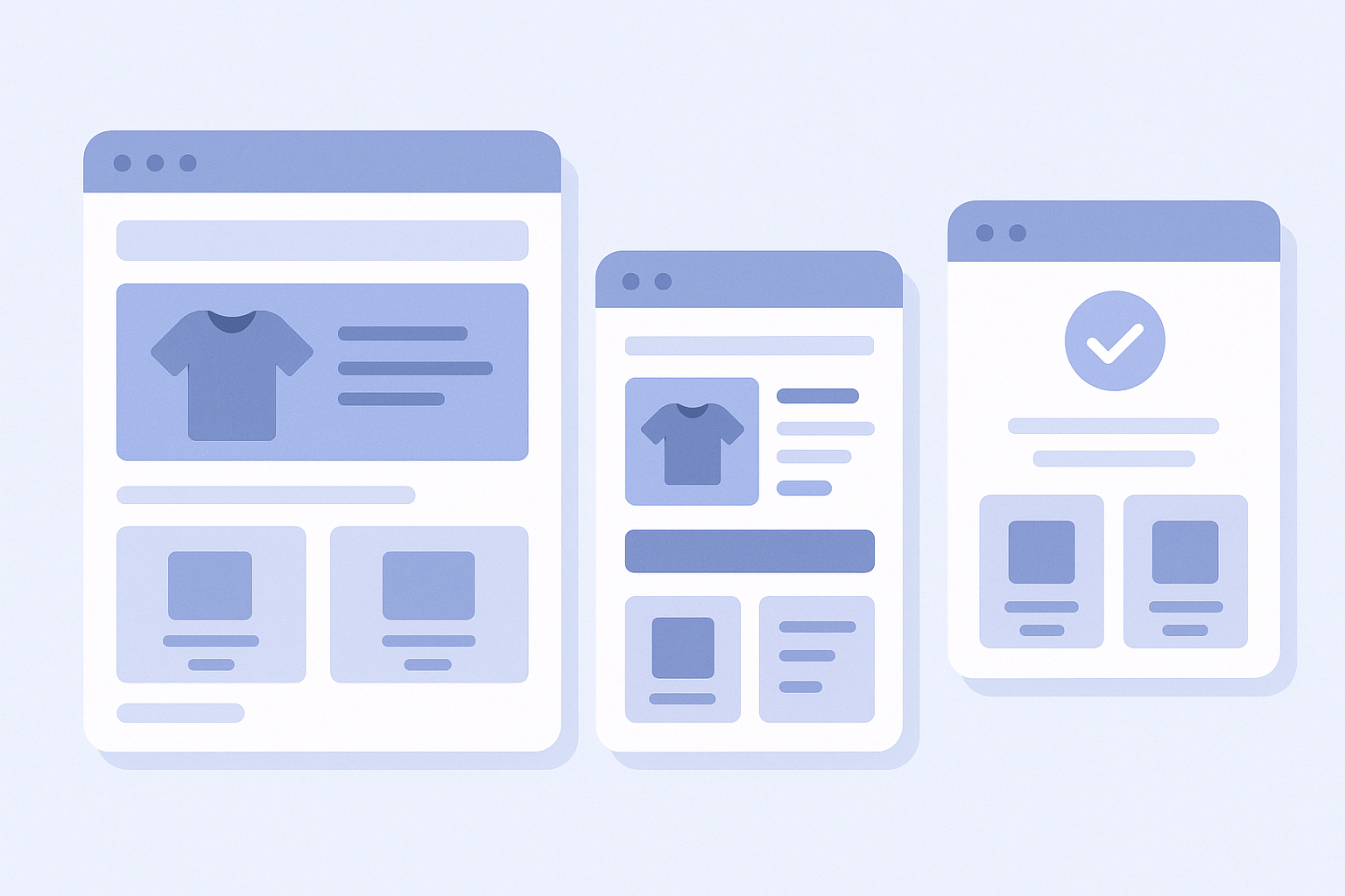
Conclusion: Design recommendations by page role
When you want to raise average order value, the fastest way is to first decide on each page what behavior you want to nudge, then place recommendations to support that.
- Product detail page (PDP): Give a push to shoppers who are still undecided
- Cart page: Increase bundle purchases and impulse add‑ons
- Thank you page: Create a reason to come back next time
Keep these roles in mind and then decide the logic, number of items, and placement that fit each page.
Before you start: define the goal of each of the 3 pages
Before touching anything, write down a one‑line goal for each page. Once that is clear, it is much easier to choose the right recommendation setup.
- Decide the goal of the product detail page (PDP): for example “Get them to add at least one item to cart first” or “Get them to add two or more items as a set.”
- Decide the goal of the cart page: for example “Increase the average item count per order by +1” or “Increase orders above an AOV of X yen.”
- Decide the goal of the thank you page: for example “Get shoppers to remember candidates for their next purchase” or “Broaden their interest into another category.”
- Check your own store’s constraints: for example fast‑changing inventory, very few SKUs, subscription‑heavy business, and so on. Understand how easy or hard it is to build recommendations under these conditions.
Once the goals are set, move on to the concrete setup steps in the next sections.
Step 1: Place PDP recommendations that reduce hesitation
On the product page the shopper is focused on a single item under consideration. Here you decide whether to lean into comparison, alternatives, or set suggestions, and place recommendations accordingly.
- Open Shopify admin → Online Store → Themes → Customize: open the Customize screen for the target theme and select any product page template.
- Add a new section inside the product page: from Add section, insert a recommendation section such as “Recommended products” or “You may also like” (or an app‑powered section).
- Set the recommendation logic toward “similar” or “related”: in your app, prioritize options like “For people viewing this product” or “Similar products.” This makes comparison easier and helps prevent exits.
- Place it right under the product information: drag the recommendation section so it sits under the product information block or under the product description. Avoid putting it at the very bottom of the page, where it tends to underperform.
- Test showing 4–8 products: in the app or section settings, adjust the number of columns and rows so you end up with roughly 2–4 columns × 1–2 rows. Too many items just create more hesitation.
- Check price range and inventory: in preview, confirm the prices of recommended products are not drastically different from the viewed product, and that out‑of‑stock items are not mixed in.
PDP checklist:
- Are recommendations visible within about two scrolls from the first view?
- Is it instantly clear that items are “similar” or “go well together” with the main product?
- Are out‑of‑stock or extremely high‑priced items excluded?
Step 2: Use the cart to drive add‑ons and bundles

On the cart page the shopper has essentially decided to buy. Here you surface a small number of highly compatible add‑ons to lift the average items per order.
- Open the cart template via Shopify admin → Online Store → Themes → Customize: from the page selector, choose Cart or Drawer cart.
- Add a recommendation section right under the cart contents: from Add section, insert a recommendation section and drag it so it sits immediately below the list of items in the cart.
- Set logic to “frequently bought together” or accessories: in your app, prioritize “Frequently bought together” or “Accessories and related parts.” Push items that naturally form a set with what is already in the cart.
- Limit the number of products to 3–4: in the section settings, adjust to a single row of 3–4 columns. Fewer, tighter options tend to get more clicks.
- Choose products with your AOV‑boost threshold in mind: if you have a free‑shipping threshold or coupon conditions, include items whose price makes it easy to reach that spend (for example, if free shipping starts at ¥8,000, focus on items in the ¥1,000–3,000 range).
- Always check mobile: in preview, use the device switcher to view the smartphone layout and confirm that recommendations appear within about two scrolls.
Cart checklist:
- Do recommendations appear immediately after “View cart”?
- Are they “things to use together” rather than just backups of items already in the cart?
- Is it clear that adding just one item unlocks free shipping, perks, or other benefits?
Step 3: Use the thank you page to seed the next visit
On the thank you page the shopper has just completed a purchase and satisfaction is high. Rather than forcing an immediate upsell, use recommendations to plant the idea of “what to buy next time.”
- Open Shopify admin → Settings → Checkout: from the menu at the bottom left, go to Settings and then select Checkout.
- Check how you can extend the thank you page: either use a Shopify‑official checkout extensions app, or if your theme supports it, use the Additional scripts for the order status page to create a recommendation slot.
- Set logic toward “repeat” and “new category discovery”: in your app, choose “Recommendations based on purchase history” or “Frequently bought together but not purchased this time.” It works well to mix in consumables they will need soon and products from other categories.
- Change the copy from “Buy now” to “For next time”: set the section title to something like “Recommended for your next purchase” or “More picks for you” to lower the pushy tone.
- Connect with coupons and email: if you offer a next‑purchase coupon or run email marketing, place the recommendation block near that notice and add copy such as “It is a great deal to use your coupon on items like these.”
Thank you page checklist:
- Does the tone avoid spoiling the “I am glad I bought” feeling?
- Are repeat‑friendly items and higher‑end upgrades included?
- Are the messages aligned with your follow‑up channels like email or LINE?
Placement tips: do not overload a single page with too many roles
More recommendation blocks do not automatically mean better results. By giving each page a single clear role you can reduce friction while still lifting AOV.
- Have only one main recommendation block per page: avoid layouts where the PDP shows “Similar items,” “Best sellers,” and “Recently viewed” all at once. Decide which one is the primary driver.
- On the PDP, go all‑in on either “comparison” or “set suggestions”: for higher‑priced, harder‑to‑decide products, lean into similar/comparison logic. For low‑ to mid‑priced products that people often buy in multiples, lean into set suggestions.
- On the cart, aim for “just one more item”: instead of trying to sell many things by listing a lot, design around a single item with a message like “Add this to make it even more convenient.”
- On the thank you page, focus on “next time,” not “right now”: even low‑urgency products are valuable as triggers for the next visit. Think of it as showing a candidate list rather than pushing for an immediate extra purchase.
- Put a review reminder in your calendar for 1–2 weeks out: do not just set and forget. Add “Check recommendation performance” to your calendar or task tool so you revisit the setup.
Common mistakes and quick self‑checks
Here are common pitfalls in recommendation placement and simple checkpoints to avoid them.
- Only placing recommendations at the very bottom of the page: in this case they are rarely seen because people do not scroll that far. → Check whether you can move them directly under the product information or cart contents.
- Using the same logic on every page: if PDP, cart, and thank you all just show “Popular products,” the context will be off. → Revisit each page with a separate purpose such as “reduce hesitation,” “drive add‑ons,” or “surface next‑time candidates.”
- Including out‑of‑stock or extremely expensive items: even if shoppers are interested, it will not convert. → If your app has inventory and price filters, enable them and visually confirm actual products in preview.
- Broken or hard‑to‑see layouts on mobile: even if it looks good on desktop, too much horizontal scrolling or tiny text on mobile kills clicks. → Use the theme preview and always prioritize checking the smartphone view.
- Leaving placements untouched without measuring impact: you lose track of which page’s recommendations are performing. → At minimum, look at click‑through rate and attach‑rate separately for PDP, cart, and thank you, using your app’s reports or Shopify order notes.
With RecoBoost you can mirror this PDP, cart, and thank you role split as is.
- From Apps → RecoBoost → Recommendation placement, configure widgets for product pages, cart, and thank you pages together
- For each widget, switch logic between AI similar products, frequently bought together, and purchase‑history‑based recommendations
- Turn on inventory and price filters to automatically exclude sold‑out and extremely high‑priced items
- Use the simple reports to see which page’s recommendations are actually moving AOV
Start with a single block each on PDP, cart, and thank you, then watch the numbers for 1–2 weeks.