
Mobile recommendation layouts that protect your sales
On mobile, how you place recommendations decides whether they’re read or just feel intrusive. This playbook shows how to optimize layouts today using four levers: folds, carousels, distance from CTAs, and avoiding layout push-down.
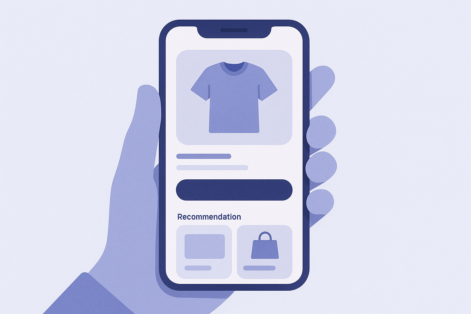
Bottom line: on mobile, go for “narrow and deep” layouts, not “wide and shallow”
If you line up lots of recommendations on mobile the way you do on desktop, the page becomes very long and UX drops fast. Focus on these three points:
- 1 purpose per screen: for each recommendation block, be explicit about what you are trying to propose in that block.
- No pushing CTAs down: do not let recommendations push core CTAs like Add to cart or Buy buttons further down the page.
- Use only touch-friendly UI: when you use carousels or collapsible sections, choose patterns that are both easy to notice and easy to tap.
With this approach in mind, you will tighten up layouts for three key areas where you can start today: the product detail page (PDP), cart, and home page.
Foundation: four mobile UX checkpoints you should always review
- What shows in the first viewport: does the very first screen on load always contain the title, price, and primary CTA such as Add to cart?
- Are tappable elements within thumb reach: can you place the main CTA and main recommendation block in the bottom third of the screen?
- Is the scroll rhythm consistent: do text, images, and recommendations alternate, without any one UI pattern dragging on for too long?
- Are you hurting load speed: are you loading too many carousel images or too many apps, making the mobile view heavy and slow?
Keeping these four points in mind, decide for each page where to place recommendations, which UI to use, and roughly how many items to show.
Step-by-step: how to quickly review and improve recommendation placement for mobile

- 1. Review key pages on an actual phone: in the Shopify admin, go to Online Store → Themes → Customize and switch the device preview in the top right to Mobile. Then open your storefront on a real phone, capture one-screen screenshots of the product page, cart, and home page, and check where recommendations are visible.
- 2. Limit product page recommendations to two blocks: in the theme editor, open your product template and review the recommendation sections.
- First block: place one block such as Similar products or Customers who viewed this also viewed right below the product info
- Second block: place one upsell block such as Frequently bought together below the description or below the reviews
If you have three or more blocks, delete or merge any that overlap in purpose. - 3. On the cart, only place recommendations directly under the CTA: open the Cart page or drawer cart template and inspect the area above and below the Proceed to checkout button.
- If there are recommendations above the CTA, remove them
- Place a single “How about adding this too?” recommendation block directly under the CTA
This prevents recommendations from pushing the CTA down the screen. - 4. On the home page, keep recommendations to one carousel plus one grid: in the Home page template, if you have several recommendation types, use the following as a guideline:
- Directly below the first viewport: a horizontal Popular products carousel (one block at most)
- Mid-page: show category-based picks such as Recommended in a 2×2 or 3×2 grid
Adding more recommendation sections than this tends to make the page too long and increases drop-off. - 5. Decide which content to collapse with accordions: if long descriptions or reviews are pushing recommendations far down the page, open the section settings and see if you can use a Collapsible row or Accordion. Then reorganize like this:
- Detailed info such as Material, Size, and Care → collapse into accordions
- FAQ → collapse into accordions
This keeps long text from hogging the screen and lets you move recommendations higher up. - 6. Tune carousel item count and arrow placement for mobile: if your recommendations are in a carousel, open the section settings and check options like Products per slide and Navigation. For mobile, use this as a rule of thumb:
- Show at most 2 products per screen; do not cram in tiny thumbnails
- Place arrows or dots just below or beside the product images, within easy thumb reach
This avoids tiny, hard-to-tap product cards. - 7. Test scroll depth and tapability on a real phone: finally, open the product page, cart, and home page on an actual phone and check:
- Do title, price, and CTA all show in the first viewport?
- From the CTA, can you reach the recommendations within two thumb swipes?
- Are recommendation cards large enough to tap comfortably one-handed?
If not, further trim the number of sections and blocks or change their order.
Placement tactics: how to think about folds, carousels, and distance from CTAs
Even with the same recommendation logic, results and UX vary a lot depending on which UI you use and how close it sits to other elements. Here is how to think about this with a mobile-first mindset.
- Use collapsible sections for information serious shoppers will read: details such as sizing, materials, and FAQs can be hidden in accordions that users open when they want to know more, then place recommendations right below. This cuts scroll length and lets you make suggestions without breaking the purchase flow.
- Use carousels only when you want users to scan a list: lining up lots of tiny cards horizontally on mobile makes them hard to tap and hard to understand. Limit carousels to cases with a small number of items (around 3–5) or where you mainly want users to browse, such as popular items.
- Treat distance from CTAs as “no-go above, OK below”: if you put recommendations directly above Add to cart or Proceed to checkout, users have a harder time finding the button they came for. In contrast, placing a small number of recommendations directly below the CTA makes it easier to nudge them toward “one more item while I am here.”
- Give each section a single goal: if one recommendation section mixes purposes like Similar items, Bestsellers, and From your browsing history, it becomes harder to choose. On mobile especially, keep it one section per logic and limit it to roughly 3–6 products so the block stays clean and scannable.
Common failure patterns and how to fix them on mobile
- First viewport is filled with recommendations: large recommendation blocks at the top of the home or product page hide the title and CTA. → Move recommendation sections one step lower and prioritize copy and the main visual first.
- Carousel items are too small to tap: cramming 3–4 products into a single screen makes both images and buttons tiny. → In mobile settings, cut it down to about 2 products per slide so images and buttons have enough space.
- Stuffing too many recommendations into cart and pre-checkout: multiple recommendation sections appear while the customer is confirming their order. → On the cart page, keep to one section directly under the CTA. Avoid putting recommendations on the checkout pages at all.
- Putting recommendations inside collapsible sections: recommendations end up folded inside components like FAQ accordions where nobody sees them. → Move recommendations outside the collapsible block and place them where they appear immediately after the explanatory content.
Next steps with RecoBoost: redesign recommendations with mobile as the default
If you use RecoBoost, you will usually see better results when you choose logics and set the number of sections with mobile as your starting point.
- Go to Apps → RecoBoost → Recommendation settings and, for product detail pages, enable AI similar products, and for the cart, enable Frequently bought together, using one logic for each location so their roles are clearly separated.
- From Theme → Customize, add RecoBoost’s recommendation sections to the product template and cart template with only one or two blocks each, and delete any extra recommendation blocks.
- On a real phone, check that RecoBoost recommendations sit directly under CTAs or right after key descriptions, and that carousels do not show too many items. If needed, adjust Number of products to display and Sort order.