
Priorities When Using Multiple Recommend Blocks on One Page
Guidelines for ordering and combining multiple recommend blocks on the same page. How many to show, which logic to put on top, combinations that do not compete, and downsides of over‑exposure.
Conclusion: Max 3 blocks per page, and do not place overlapping logics together
When you place multiple recommendation blocks on the same page:
- Keep the number of blocks to three or fewer
- Give each block a single role (browsing aid, cross-sell, upsell, etc.)
- Do not line up logics with similar intent in the same spot, like AI Similar Products and AI Related Products
If you follow these rules, your layout is less likely to interfere with sales and conversions.
Below, we compare typical logics to explain on which page, which logic, and in what order you should place them.
Overview of the logics being compared
Here we group commonly used Shopify store recommendation logics into three roles and compare them. Actual logic names vary by app, but we will use five representative ones: AI Similar Products, AI Related Products, Frequently Bought Together, Browsing History, and Ranking (Best Sellers).
- AI Similar Products: suggests items close in price, design, or use to the one currently viewed. Role: surface alternative options for users who are unsure about this product
- AI Related Products: suggests items often used together with the current product, or connected by use case. Role: propose sets and outfits
- Frequently Bought Together: suggests items that are often purchased together based on past orders. Role: cross-sell grounded in actual purchase data
- Browsing History: resurfaces products the user recently viewed. Role: make it easy to go back and compare items
- Ranking (Best Sellers): lists items by popularity. Role: show safe, proven options to users who are undecided
Among these, the following combinations are prone to “compete” with each other when placed together on the same page, because their roles overlap.
- AI Similar Products × Ranking (Best Sellers) (both output “other candidate products”)
- AI Related Products × Frequently Bought Together (both output “items to buy together”)
Conversely, the following combinations have clearly separated roles and are easier to place together on one page.
- AI Similar Products × AI Related Products (alternatives plus set suggestions)
- AI Similar Products × Browsing History (alternatives plus revisit links for comparison)
- Ranking (Best Sellers) × Browsing History (popular items plus each user’s own trail)
Product page: which logic to use, and in what order
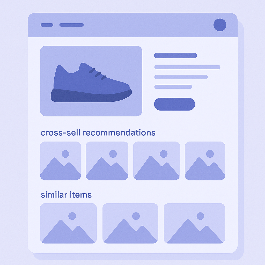
The product page is where users decide whether to buy, so you should prioritize blocks that push the purchase forward. Here is how the candidate logics compare.
- AI Similar Products: when a user is unsure about the current item, it can turn an exit into a switch to another product. It also keeps price and category relatively close
- AI Related Products: increases cart size based on the current product. Good for accessories, sets, coordinated items, and similar
- Frequently Bought Together: when you have enough historical data, it enables highly reliable cross-sells
- Browsing History: makes comparison easier, but can also scatter attention and pull focus away from the current product
- Ranking (Best Sellers): if it surfaces items from different categories, it can easily drift away from the intent of the product page
Here is a recommended priority order when placing multiple logics on a product page.
- Priority 1: AI Related Products or Frequently Bought Together
- Goal: increase items per cart and AOV
- Placement: just below the product description to just below the Add to Cart button - Priority 2: AI Similar Products
- Goal: prevent exits by offering alternatives
- Placement: at the very end of product content, such as below reviews - Priority 3: Browsing History (only if needed)
- Goal: support product comparison
- Placement: near the very bottom of the page, in a relatively small block
You should avoid the following combinations on product pages.
- Placing AI Related Products and Frequently Bought Together back to back (very similar cross-sells in a row create information overload)
- Placing AI Similar Products right next to the Add to Cart button and weakening purchase intent (users start thinking “maybe I should look at others”)
- Stuffing four or more blocks on the product page (slower page load and less focus on the main product)
Home and collection pages: layouts focused on discovery
On home and collection pages, a large share of users have not yet decided what to buy, so the main role is discovery and creating entry points. Here is how each logic fits that role.
- Ranking (Best Sellers): an entry point for first-time and light users. Shows options that are unlikely to disappoint
- Browsing History: for repeat visitors and users still considering options. Lets them quickly resume where they left off
- AI Similar Products: better suited to collection and product pages than the home page. If you show many of these on the home, context easily becomes weak
- AI Related Products and Frequently Bought Together: they need a “base product” to work, so they are more effective on product pages than on the home
Here is a suggested structure and priority order when placing multiple blocks on the home page.
- Priority 1: Ranking (Best Sellers)
- Goal: show flagship products to first-time visitors
- Placement: directly below the main visual (hero) - Priority 2: Browsing History
- Goal: let returning users immediately resume their evaluation
- Placement: below Ranking, or near the bottom of the page - Priority 3: category-specific rankings or editorial AI Similar Product blocks
- Goal: guide users into specific categories
- Placement: mid to lower sections of the page
On collection pages, the following combinations are generally easy to manage.
- Ranking (Best Sellers): show only the best sellers within that collection
- AI Similar Products: at the bottom of the collection, show items similar to the ones the user viewed
- Browsing History: add it as a small block near the bottom of the collection page
On both home and collection pages, packing in four or more blocks leads to noticeable downsides.
- Page load takes longer, and the first view above the fold appears more slowly
- Users cannot tell which block is meant for them, so CTR drops across the board
- Impact of key blocks, such as Ranking, becomes weaker
Common failure patterns with multiple blocks, and how to avoid them
Finally, here are common failure patterns with multiple-block layouts, compared in terms of which logic combinations tend to cause which issues.
- Failure 1: showing everything at once
- Situation: the product page stacks AI Similar Products, AI Related Products, Frequently Bought Together, and Browsing History vertically
- Problem: users’ attention is scattered and no block gets clicks. Exits from the main product also increase
- Fix: if blocks have similar roles, keep only one. Set a hard limit of three blocks per page - Failure 2: cross-sells get in the way of checkout
- Situation: AI Similar Products and Ranking blocks are placed right next to the Add to Cart button, creating more paths to “go look at other products”
- Problem: even users who already decided to buy get distracted, and CV drops
- Fix: around the Add to Cart area, show only “add-on proposals” that assume the current product, like AI Related Products or Frequently Bought Together - Failure 3: a recommendation-heavy home hides the brand
- Situation: most of the home page is filled with Ranking, Browsing History, and multiple AI-based blocks
- Problem: brand story and positioning do not come through, and the site looks “cheap” or cluttered
- Fix: use the upper half of the home to clearly show the brand and core categories, and group recommendation blocks together in the lower half as a supporting element
As a rule of thumb, keep it to two or three recommendation blocks per page with clearly different roles. Instead, invest effort into their placement, order, and headings. This tends to stabilize both CTR and CVR more than simply adding more blocks.
Next steps for testing multiple logics with RecoBoost
If you are using RecoBoost, you can test the priorities and combinations above as is. As a practical next step, try the following flow.
- Open Shopify admin → Apps → RecoBoost and check how many blocks are currently shown on which pages
- In each widget settings screen inside RecoBoost, list out the logic names (for example AI Similar Products, AI Related Products, Ranking, Browsing History) and the pages where they appear
- For product pages, adjust widget display ON/OFF and placement so that you have at most three blocks: one cross-sell type, one Similar Products block, and optionally one Browsing History block
- On the home page, place a Ranking block right under the hero, then one Browsing History block below that, turn other recommendation blocks off for now, and watch how CTR changes
- After monitoring metrics for two to four weeks, if needed, A/B test two structures, such as prioritizing AI Related Products versus prioritizing Frequently Bought Together
Rather than increasing the number of blocks, you will get more out of an AI recommendation app like RecoBoost by carefully selecting just one to three logics with distinct roles per page. Start by revisiting priorities and placement on your product and home pages.