
How to Use View Rankings vs Purchase Rankings on Shopify
View rankings and purchase rankings should spotlight different products. This guide clarifies their goals and metrics, and shows how to place each on your homepage and collection pages for real-world results.
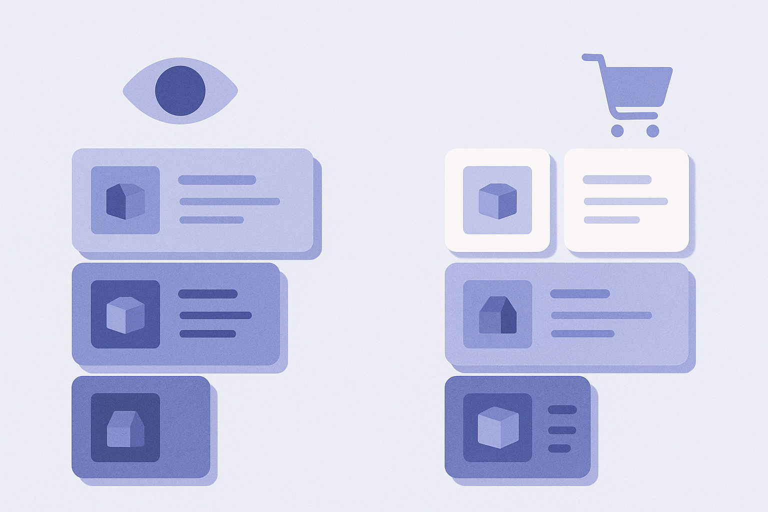
Bottom line: when in doubt, use view rankings on the homepage and purchase rankings near purchase paths
View rankings and purchase rankings are not about which is better, but about where each one should be used. When you are unsure, use this rule of thumb:
- Homepage: start with a view ranking section. Show products that are getting attention right now to increase browsing depth
- Collection index pages: use a view ranking section so you can nudge visitors toward which products to look at first
- Below product details / near the cart: prioritize purchase rankings to give that final push to people who are still deciding
- Sale or campaign pages: prioritize purchase rankings, combining them with inventory information to avoid highlighting items that are about to sell out
From here, we will整理 the different goals and data behind each type, and look concretely at when and where to show them to best impact revenue.
Different goals of view rankings and purchase rankings
- View rankings:
- - Goal: surface popularity and buzz so people think “I will at least check these out” and start browsing
- - Metric: based on how many times products were viewed, such as product page views or sessions
- - Strength: great for pushing new items or visually strong products to the front and driving overall browsing across the store
- - Weakness: items that get lots of views but few purchases can sit at the top as fake “popular products”
- Purchase rankings:
- - Goal: show proof that items are selling well and push customers toward completing a purchase
- - Metric: based on how often or how much items were bought, such as order count, units sold, or revenue
- - Strength: a powerful persuasive tool for shoppers who are comparing options, by showing that “everyone is buying this”
- - Weakness: tends to favor past bestsellers, making it easy for new items and niche categories to get buried
Put simply, view rankings act like a radar that widens interest, while purchase rankings provide the final nudge. They are both “rankings,” but they play very different roles.
How to split usage between the homepage and collections
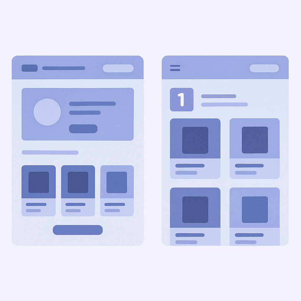
In actual layouts, decide which to show based on what stage the user is in. Let us break it down for the homepage and collection pages.
- Homepage: use view rankings first to widen the entrance
- - Many visitors are new and are trying to quickly understand “what kind of site this is”
- - Placing a view ranking section right under the hero banner (main visual) makes it easy to grasp “what is popular now” by category or product and drives more browsing
- - During sale periods or campaigns, a layout that shows view rankings under the banner and purchase rankings a bit further down works well to highlight both “buzz” and “bestsellers”
- Collection pages: use view rankings to control the order in which people look at items
- - Visitors have already narrowed down to a category and are in the phase of deciding “which items in this list to look at first”
- - Inserting a view ranking block near the top of the collection creates a path that says “start by checking out these items”
- - Placing it near filters and sort controls gives users a reference point when they are unsure what to click next
- Place purchase rankings next to users who cannot quite decide
- - Position them close to users who have progressed into concrete comparison and consideration
- - Example: show a purchase ranking for items in the same category at the bottom of the product detail page
- - Example: on the cart page, show “items frequently bought in the same category” as a purchase ranking
Think of it this way: the further upstream in the journey (entry points), the more you use view rankings; the further downstream (right before purchase), the more you use purchase rankings. This makes layout design simpler.
How to choose which to use: scenario-based thinking
- When you want to strongly feature new products
- - New items usually attract views easily, but they often have little purchase data right after launch
- - First, get them into the view ranking on the homepage and in relevant collections to increase views, then let them float up in purchase rankings once sales start to build
- For repeat-heavy or staple-product ecommerce
- - The value is literally “what everyone always buys,” so purchase rankings are extremely persuasive
- - Showing category-level purchase rankings in a list around the midsection of the homepage makes it easier for shoppers to add proven staples to their cart without overthinking
- When you have plenty of traffic but your CVR is not growing
- - It may be that you are collecting views but not converting them into purchases
- - Keep view rankings at the entrance, but add purchase rankings under product details and near the cart to solve the “I do not know which one to buy” problem
- Stores with very large SKU counts (apparel, general online retailers, etc.)
- - With simple sorting, many products end up buried and never really seen
- - Upstream: prominently show view rankings on category tops so users can quickly grasp what is trending
- - Downstream: after filtering or size selection, use purchase rankings to present “safe choices”
Instead of choosing only one type, assume you will use both and place them according to the user’s consideration phase. That is how you maximize the value of ranking blocks.
Using RecoBoost to flexibly switch between view and purchase rankings
With RecoBoost, you can switch between view rankings (based on page views) and purchase rankings (based on revenue or purchase count) as recommendation logic and place them as blocks on your homepage or collections.
- In the Shopify admin, go to Apps → RecoBoost and create a new recommendation block
- In the block display settings, choose Homepage or Collection page and set a view ranking block at the entry points
- Create another block, select Purchase ranking as the recommendation logic, and place it at the bottom of product pages or near the cart
- Before publishing, use Preview to confirm the placement and appearance, and also check scroll depth on mobile
A good starting setup is view rankings on the homepage and purchase rankings below product details. Then adjust placement and scope over time based on click-through and conversion data.