
Gentle post‑purchase offers on the Shopify thank you page
A practical guide to adding related products on your Shopify thank you page without feeling pushy. Covers which recommendation logic to use, wording and layout that feel like help not hard sell, common pitfalls, and how to set it up with RecoBoost.
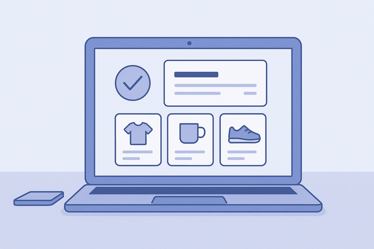
On the thank you page, aim for a gentle suggestion not a hard upsell
The thank you page (order status page) is a special screen that only appears right after you say thanks for your purchase. What you should do here is not pushy upsells, but suggestions that make the current order better.
The keyword is post‑purchase, but if you lean the message toward preventing failure and adding enjoyment rather than getting them to buy more, the hard‑sell feel drops sharply.
In this playbook, in a format you can try right away, we will cover:
- Recommendation logics that work well on the thank you page
- How to configure the thank you page on the Shopify side
- How to present and place offers so they do not feel pushy
- Common failure patterns
Before we start: what you should show on the thank you page
Recommendations on the thank you page have a slightly different purpose from those on the cart or product page. For now, just keep these three points in mind.
- The goal is not higher AOV, but satisfaction plus light additional purchase
- The main viewing window is roughly one to two minutes right after checkout is completed
- Customer mindset is basically I am relieved I could buy and I want to leave quickly
Because of that, the following kinds of offers work better than aggressive ones.
- Care products to help them use what they bought for longer, such as cleaners, cases, and replacement parts
- Accessories that expand how they can use the item, like extra cables, additional parts, and consumables
- Proven combinations such as classic sets that are often used together
On the other hand, you should avoid the following here.
- Proposing an immediate switch to a much more expensive higher‑end model
- Listing alternative products that overlap with the main item, which can make them worry they bought the wrong thing
- Overusing pressure phrases like limited time only X% off
With that premise in mind, let us move into the concrete setup steps.
Steps: add a related products block to the Shopify thank you page
Here is how to edit the standard Shopify thank you page and embed a block from your recommendation app, step by step so you know exactly what to click. Replace the app name with whatever you are actually using.
- In the Shopify admin, open Settings and then Checkout
- In the Checkout settings screen, click Brand / Customize, which links to the theme editor, and in the dropdown at the top of the preview select Order status page
- In the section list on the left of the theme editor, under Order status page click Add section, then choose the block provided by your recommendation app, for example RecoBoost レコメンド
- Select the added recommendation section and, in the settings panel on the right, choose AI similar products or Frequently bought together as the recommendation logic
- In the same settings panel, set the number of products to display to three or four, and change the heading text to something soft like Make your order even more convenient or Items that are handy to use together
- Adjust the layout order by drag and drop so that the recommendation block appears right below the Order details block
- Click the Save button in the top right to publish, then place a test order and check that recommendations show correctly on the thank you page
If your app separately lets you choose which pages to show on, go into the app admin and in the Display pages or Widget placement settings, enable the Thank you page (order status page).
Tips on recommendation logic and placement that do not look pushy

For the thank you page, prioritize logics that complement what the customer just bought. The two main options are these.
- AI similar products: a logic that surfaces items with the same use case or style. Mixing in products with a similar or slightly lower price than the original purchase gives a sense of reassurance.
- Frequently bought together: a logic that, based on past purchase data, surfaces sets that pair well with the current order. It works especially well for care products, consumables, and accessories.
For post‑purchase in particular, you can make it feel more like a suggestion with the following presentation tweaks.
- Make the heading lean toward gratitude and support
- Bad example: Limited‑time offer! Extra X% off when you add now
- Good example: Thank you for your order. These items are often chosen together - Focus the copy on use cases rather than price
- Under the product name, add a short line like Helps prevent dirt so you can use it longer or It is reassuring to have a spare for travel. Use the app’s sub‑text feature if available. - Limit the number of items shown to three or four
- Showing six or more makes it look like a sale rack
- It is easier to build trust if it feels like a carefully curated selection instead - Place it right under the order information and above tracking info
- If it is too high, it pushes down the order details and causes stress
- If it is too low, customers will likely leave without ever seeing it - Keep any discounts light
- Small offers like Thank you page exclusive 5–10% off are enough
- Rather than lots of bold red text, mention the discount casually within the description copy
If you follow these points, your post‑purchase offers will feel natural and customers will at least think I might as well take a quick look.
Common mistakes and how to avoid them
A small configuration mistake can easily make thank you page recommendations feel like a hard sell. Eliminate these common errors up front.
- Putting high‑priced upsells front and center
- Example: someone buys a 3,000 yen product and you immediately slam a 30,000 yen higher‑end model in front of them
- Fix: create a dedicated thank you page collection and limit the logic to products within a certain upper price range - Showing alternatives that make customers anxious
- Example: you line up several different designs of smartphone cases right after they bought one
- Fix: prioritize the Frequently bought together logic and limit it to complementary sets, like case plus film plus strap - Overdoing coupon‑driven messaging
- Example: copy like You lose out if you do not buy now or This page only: half price that rushes them
- Fix: keep the tone to something like As a thank you for your purchase, we are offering related items at a small discount - Making the page too long on mobile
- Images are so large that even after scrolling, all you see are product images
- Fix: in the app’s layout settings, reduce the image aspect ratio and cap the number of products at three to four - Leaving it on autopilot without knowing results
- Fix: at minimum, check impressions, clicks, and additional purchases in the app, and remove product types from the thank you page collection if they do not get clicks
In particular, if you prepare a collection dedicated to the thank you page, you will be able to keep making stable suggestions even if you later change the logic or the app itself.
With RecoBoost you can quickly test post‑purchase‑specific logic
If you use RecoBoost, you can quickly test thank you page recommendations with the following steps.
- In the Shopify admin, go to Apps and open RecoBoost
- In RecoBoost, go to Recommendation widgets, click Create new widget, and choose Thank you page as the page type
- In the widget settings, set Frequently bought together as the primary logic and, if needed, set AI similar products as a secondary logic to auto‑fill when the main one lacks candidates
- In Product source, specify your thank you page collection so that overly expensive products and alternatives are excluded in advance
- In the Design tab, set the number of items to display to three or four, choose either a single‑row horizontal scroll or a two‑column grid layout, and change the heading to something like Thank you for your order. These items are often chosen together
- Click Save in the top right, then Show installation steps, and following the guidance go to Online store, then Themes, then Customize, add the widget block to the Order status page, and Save
- After running it for one to two weeks, go to Reports in RecoBoost, then Performance by widget, check impressions, click‑through rate, and additional purchases, and fine‑tune by removing low‑performing product types from the collection
On the thank you page, post‑purchase works better when you polish a single widget carefully. Start small and operate with the mindset of learning which complementary items customers are happy to add.