6 checkpoints to improve Shopify checkout UX and lift CVR
If you see heavy drop-off in your Shopify checkout, start by fixing six basic UX elements. From trimming form fields to clarifying shipping and payment, error handling, and mobile UX, here are practical improvements you can make with Shopify’s built‑in features.
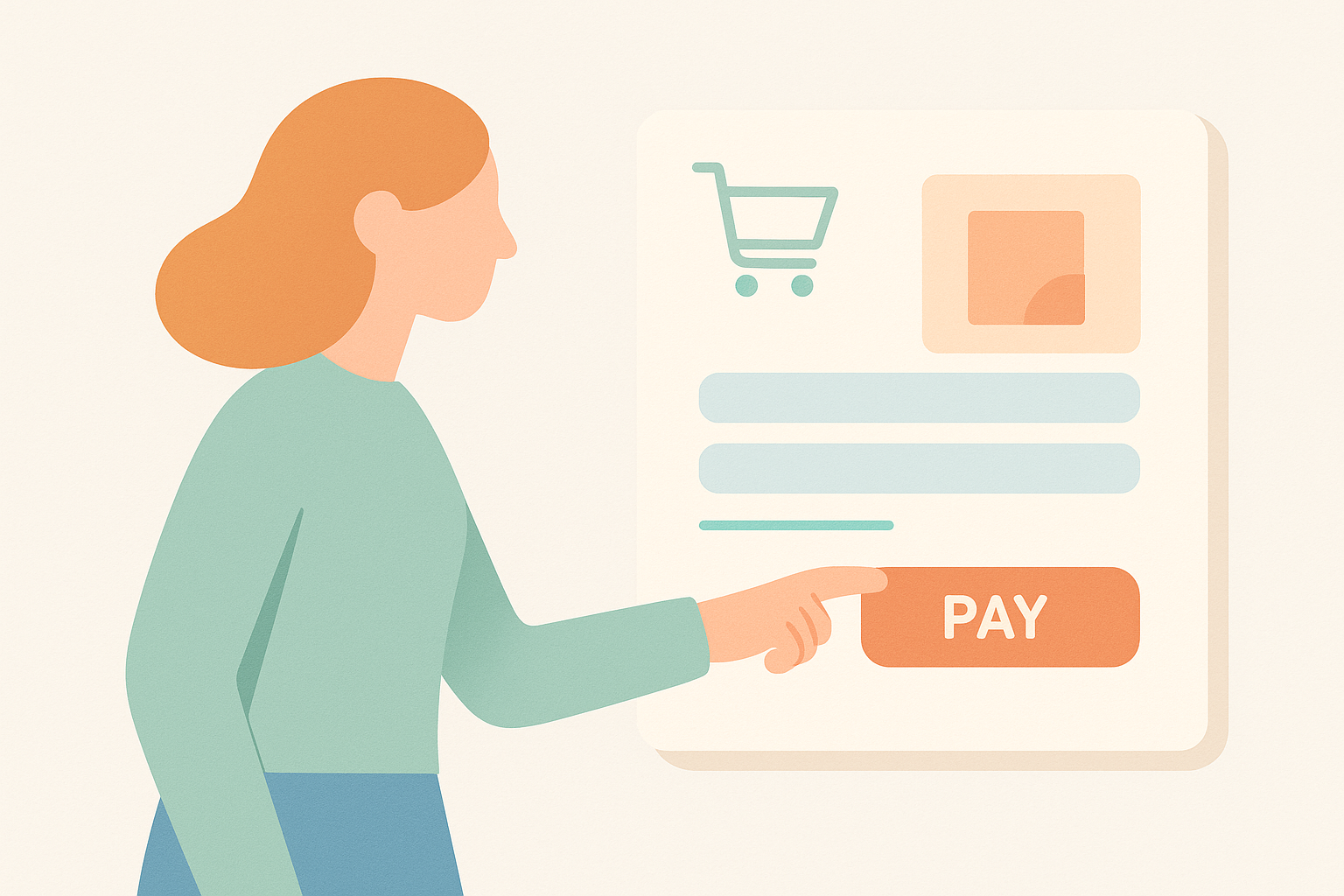
Checkout drop-off is driven by lots of small points of friction adding up. Even without special apps or custom development, simply tuning Shopify’s standard settings and UI can often improve your CVR by several percentage points. This article整理 six checkpoints merchants should review regularly to improve Shopify checkout UX. The ideas are concrete enough that you can open your settings and theme editor today and work through them one by one.
1. Minimize input fields and remove the “this is a hassle” feeling

The first thing to review is which fields you’re asking customers to fill out at checkout. Shopify’s official docs also recommend “only asking for information that is required” in checkout fields. The more fields there are on a single screen, the more effort it takes and the higher the risk of abandonment. One domestic store saw its checkout completion rate improve by about 5% just by removing the “Company name” and “Optional note” fields. Even a single extra field can show up clearly in your numbers.
In the Shopify admin under Settings > Checkout, you can set address, phone number, and other fields as Required, Optional, or Hidden. For typical B2C physical products, the Company name field can usually be Optional or Hidden with no issues. For the Phone number field, look at your carrier requirements and undelivered-package risk and decide whether it truly has to be required. For digital products and subscriptions in particular, it’s effective to strip out any information that isn’t needed for fulfillment.
A common mistake is adding survey questions or internal memo fields “because we might use them for something someday.” Even if a field is convenient for your operations team, from the customer’s perspective it often just looks like a confusing question. If you really need to ask additional questions, separate them out by linking to a survey on the thank-you page or in post-purchase emails, and keep the flow up to payment as simple as possible.
2. Limit shipping options and wording so customers aren’t forced to think
One of the biggest reasons people abandon after adding items to cart is that “shipping methods and fees are unclear.” Shopify lets you set up shipping rates and methods flexibly under Settings > Shipping and delivery, but if you add too many options, customers won’t know which to choose. It’s safest to limit shipping methods to roughly two or three patterns so price and delivery speed can be compared at a glance.
For example, you might offer just two clearly distinct plans, such as “Standard shipping (◯–◯ business days)” and “Express (earliest ◯ days).” In Shopify’s shipping settings you can set the name, price, and conditions for each method. Use customer-facing labels that make sense, instead of internal terms like “XX Transport Size 60.” Even if you can’t guarantee an exact arrival date, stating a range like “Estimated ◯–◯ days” helps reduce uncertainty for customers.
A common failure pattern is showing four or five shipping methods with almost the same price and lead time. Merchants tend to want to separate by carrier, but customers don’t care which company delivers the package. Look at your checkout screen and整理 both the number and names of shipping methods based on this question: “If I were a first-time buyer here, could I choose without hesitation?”
3. Offer the core payment methods your target customers actually use
From a checkout UX standpoint, “my preferred payment method isn’t available” is one of the biggest abandonment triggers. Through Shopify Payments and various payment apps, you can add many methods, but if you add them blindly you just end up with a clutter of buttons. In reality you want to identify the must-have options based on your customer profile and main device (desktop or mobile), and then limit methods to the minimum necessary.
At many stores using Shopify, the workhorse methods are credit cards plus regionally common digital wallets (for example, Apple Pay). When you enable Shopify Payments, these accelerated checkout buttons are shown automatically in supported regions. Stores with a high mobile share especially tend to see strong usage of one-tap wallet payments; since checkout can be completed in a few seconds, this significantly improves UX.
When adding methods like buy-now-pay-later or convenience store payments, you need to coolly weigh fraud and cancellation risk, fees, and your target customers’ needs. For younger audiences, deferred payment demand may be high, whereas for more B2B‑leaning products, credit card alone may be sufficient. In Shopify’s payment settings you can check sales by payment method for the last three months; one practical approach is to temporarily disable methods with very low usage to clean up the UI.
4. Use error messages and validation to show “what’s wrong” immediately
A commonly overlooked source of frustration during checkout is unclear errors. If an address format or postal code length throws an error but the customer can’t see which field is wrong or why, some will simply abandon. Shopify’s standard checkout has basic validation and error messages, but depending on your theme customizations or added scripts, those messages may have become hard to notice.
In practice, it’s effective to test your own checkout on both mobile and desktop and deliberately enter incorrect postal codes and phone numbers. Check for issues such as “a red warning appears at the very top but customers won’t notice it” or “you have to scroll to find which field is in error.” If errors are easy to miss, adjust colors and spacing in the theme editor to make messages more visible.
Also be careful with external widgets and popups that switch pages while the form is being filled out, as they tend to cause unstable behavior when errors occur. For example, if a signup popup appears mid-input and when the user closes it all their entries are gone, they are likely to abandon. Whenever you introduce a new app or script, make sure to test error behavior within the checkout flow as well.
5. Design mobile-first so the entire flow can be completed one-handed
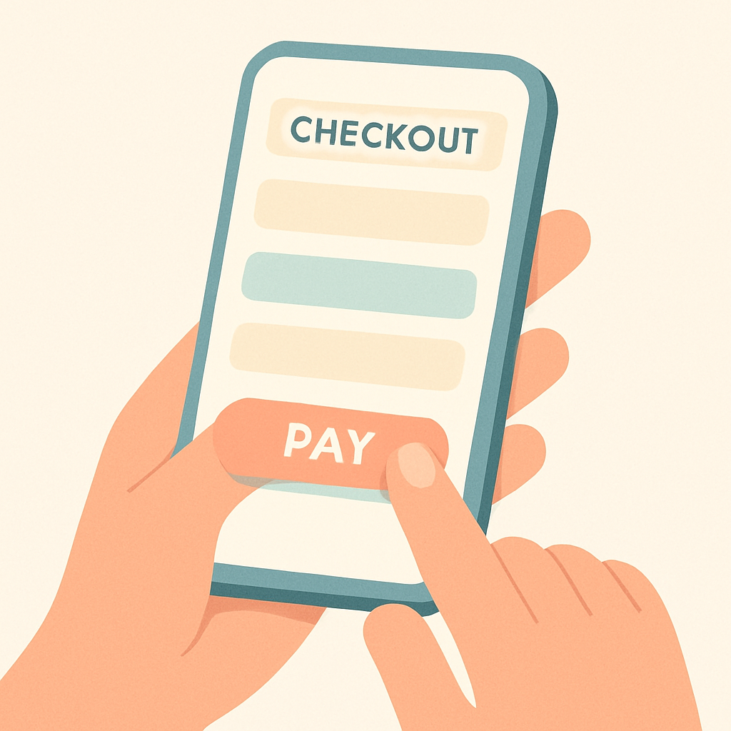
For many Shopify stores it’s normal for 70–80% of traffic to come from smartphones. Even so, a lot of stores still design their layout around desktop. If you want to improve checkout UX, the top priority should be “mobile usability.” Review the flow based on whether it’s easy to enter information one-handed and whether buttons are easy to tap.
Modern Shopify themes and checkout are responsive by default, but custom code or app banners can unintentionally hide buttons below the fold or make text extremely small. Fixed banners and chat widgets that stick to the bottom of the screen are especially risky—always check that they don’t overlap the “Proceed to payment” button. If buttons are too close together, accidental taps and user frustration will increase.
When you actually start improving things, use your phone’s screen recording feature and have staff run through a real checkout. This makes sticking points visible. Seemingly minor issues like “the keyboard doesn’t switch to email mode” or “a numeric field brings up an alphabetic keyboard” are also sources of friction. Fixes may require theme or app adjustments, but they’re worth prioritizing for a better mobile experience.
6. Review the full path from cart to checkout as one continuous flow
In reality, checkout UX is defined by the entire flow from product page to cart to completed order. If the coupon field dominates the cart screen and sends people off to hunt for coupons, or if the cart-to-checkout button doesn’t stand out, abandonment will rise at that stage. You need to optimize not just checkout itself, but also the preceding cart page and the transition between them.
Concretely, check the following points.
- Is the “Proceed to checkout” button on the cart page visually prioritized over other buttons?
- Are you asking customers to fill in too much information in the cart (gift options, notes, etc.)?
- Is the coupon field so prominent that customers without coupons feel like they’re missing out?
- Are you giving customers a realistic idea of shipping and fees before checkout so there’s no big discrepancy later?
Even before you start running cart abandonment emails or retargeting ads,整理 this end‑to‑end flow from cart to checkout alone can often improve CVR by a few points. Have someone on the team run a full test purchase at least once a month and log findings in checklist form so you can catch UI degradation early.
How to apply these ideas if you use RecoBoost
If your store uses RecoBoost, it’s worth revisiting how and where you show recommendations in the context of checkout UX. Recommendations on cart and product pages can help improve CVR, but if placement or volume is off they can actually weaken the path to checkout. For example, on the cart page, limit recommendations to a small “Don’t forget these” block and avoid placing a large recommendation section above the “Proceed to checkout” button. In RecoBoost’s section settings, fine-tune placement, number of items, and mobile layout to balance “higher average order value” with “a smooth path to checkout.”
Improving checkout UX isn’t something you do once and forget; every settings change or new app risks chipping away at it. By routinely reviewing what you can do with Shopify’s standard checkout and theme editor—and continuously applying three principles: remove fields, reduce confusing choices, and test with a mobile-first lens—you can raise CVR without increasing ad spend.