How browse‑history recommendations work (and where they break)
Browse-history recommendations are an easy first step into personalization, but if you do not understand how they work and where they fail, they turn into a “just showing something” block. This article breaks down the logic, limits, and Shopify implementation tips from an operator’s view.
“Recommended for you” based on browse history is one of the easiest personalization features to roll out on a Shopify store. But if you add it without understanding how it works and where its limits are, it ends up as a block that “just happens to be there,” with no visible impact on revenue. In practice, even with the same “browsing-history recommendations,” click-through rate can vary more than threefold depending on placement and rules. This article organizes the basic mechanics and limits of browse-history recommendations, and the resulting design points, from the perspective of a Shopify store operator. At the end, there is also a single example of how to make use of them with RecoBoost.
How browse-history recommendations basically work
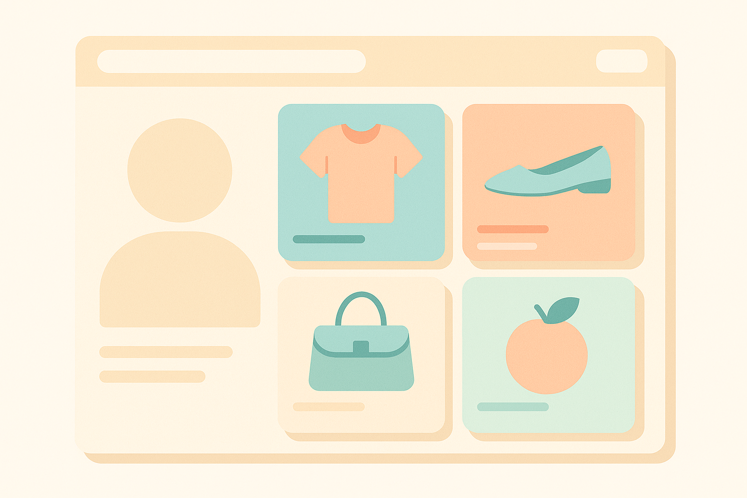
As the name suggests, browse-history recommendations build suggestion candidates from “which product pages this user has recently viewed.” In most cases, a list of “viewed product IDs” and their “view order and timestamps” is stored in the browser via cookies or local storage, or tied to the logged-in customer ID.
For example, say a user viewed products A, B, and C in that order. Based on this history, recommendations are generated using logic such as the following. One pattern is to “re-display the products the user recently viewed” themselves. Another is to aggregate “products that other users who viewed A/B/C also frequently viewed (or bought).” Many Shopify apps and theme features generate “Recently viewed items” and “Recommended for you” using a combination of these approaches.
What operators need to understand is that browse-history recommendations “react to past behavior” and do not “magically understand needs or stock status.” You therefore have to decide how far you rely on this mechanism, and from where you switch to manual recommendations or other logic. Drawing that line in advance is important.
How far can you actually personalize?
Browse-history recommendations are good at “helping users recall items they were considering” and “broadening exposure to similar items with a similar feel.” If a user has viewed products in the same category multiple times, lining up variations within that category by price range, color, or size lets you bring abandoned consideration back onto the table. In stores with relatively high add-to-cart rates, even a simple combination like “recently viewed products + products from the same category” can improve product-detail click-through by a few percentage points.
At the same time, you should keep in mind that “number of views does not equal purchase intent.” Some users skim through 10+ products in a short time just to compare, while others are “just browsing” with no real intent to buy. From browse history alone, you cannot perfectly tell which products are the “real contenders” and which should be excluded. If you over-score purely on view count or dwell time, you risk persistently pushing products that actually ought to be filtered out.
The word “personalization” often makes people picture “perfectly optimized recommendations for each individual,” but with browse history, what you can realistically do is closer to “slightly narrow down candidates within the categories and price ranges the user has shown interest in.” It is far from万能, but compared with “show nothing” or “show the exact same ranking to everyone,” it does at least align display content more closely with user behavior, which is its strength.
When browse-history recommendations do not fit
There are a few typical patterns in stores where browse-history recommendations do not perform well. The first is stores where “visit frequency is low and users view very few items per visit.” For example, with high-ticket items where customers visit only once a year and leave after viewing just one or two products, the history is too thin for the recommendation logic to work properly. It can still render a block, but in practice the output tends to be “almost the same as newest-first.”
The second pattern is products “for one-off, self-contained use.” For example, goods for a one-time event or single-use digital products where one item fully satisfies the need. In such categories, “showing lots of similar items” does not necessarily improve user experience. In fact, repeatedly showing the same item the user already saw can backfire, making them feel “I keep seeing the exact same thing over and over.”
The third is when “stock, price, or campaign status is not taken into account.” Depending on how it is implemented, browse-history recommendations can happily show “sold-out products” or “items at old prices that are no longer on sale.” A common real-world pattern is that, after a sale ends, the sale items remain in the browse history, the user clicks from the recommendation, finds the price back at normal, and leaves. Before optimizing the recommendation logic itself, it is higher priority to set up filter conditions so that “products you should not be selling are not displayed at all.”
Key points for implementing this on a Shopify store
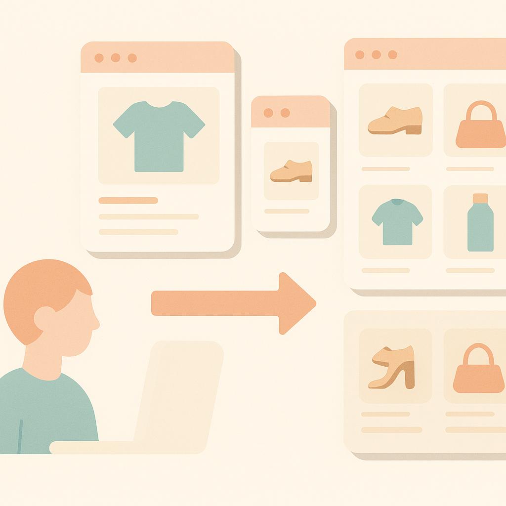
When implementing browse-history recommendations on a Shopify store, the first thing to decide is “on which pages, and from what time window of history, you will draw from.” Common placements are on the home page and near the bottom of product-detail pages, but setting simple rules like “up to the most recent X items” or “only views within the last X days” makes it easier for users to understand that “my recent views are what is being shown.” If you do not set a time window, out-of-season products may keep appearing indefinitely.
Next, “sorting and mixing” is critical. Instead of outputting only “recently viewed items” as-is, mixing “recently viewed items + bestsellers in the same category” at a fixed ratio gives credibility even for users with little history. For example, within a four-slot recommendation section, you might allocate “two slots for browse-history-based items and two slots for bestsellers,” which also makes A/B testing and analysis easier.
In day-to-day operations, you can also consider changing the fallback (what is shown when history is insufficient) by user type, such as “new visitors,” “repeat visitors,” and “logged-in members.” For users with almost no browse history, show ranking-based recommendations; for users who have visited multiple times, prioritize browse-history-based plus purchase-history-based recommendations. You do not need to build everything at once, but simply deciding upfront “what to show when there is no history” already reduces wasted recommendation space.
Common mistakes and easy fixes
A common failure pattern with browse-history recommendations is “just dropping a single block near the bottom of the page and calling it done.” On product-detail pages with low scroll depth, recommendations at the very bottom are often barely seen; when you actually check, click-through rates under 1% are not unusual. If you still believe “we are doing solid personalization,” you will overlook the areas that actually need improvement.
An easy improvement is to first “change the recommendation placement once and A/B test it.” On product-detail pages, compare a pattern where the recommendation sits right below the description versus one where it appears below the reviews, then look at click-through and add-to-cart rates. Simply shifting the placement slightly can sometimes double or triple click-through.
Another quick win is to label “often viewed together” items separately from “recently viewed items.” When users understand “why this product is shown,” they feel more confident about clicking. Even just labeling sections clearly, such as “Recently viewed” and “Often viewed together,” raises the perceived level of personalization and, as a result, improves response rates.
How to make the most of this with RecoBoost
When using RecoBoost, it is better not to treat browse-history recommendations as “the one correct answer,” but to build sections that combine multiple logics such as bestsellers and related products. For example, on a product-detail page, place small sections for “Recently viewed items,” “Recommendations from your browse history,” and “Storewide bestsellers,” then compare their click-through and revenue contribution using the app’s reports. This makes it easier to quantify “how effective browse-history-based recommendations are for this store,” and to run a practical optimization cycle on the ground: expand recommendation areas only where they work, and switch underperforming areas over to different logic.
Browse-history recommendations are a very manageable entry point into personalization, but if you rely on them alone they remain a mechanism that merely “replays past behavior.” Understanding their limits, then deciding on which pages, from which history, and in combination with which other logics you will use them—and iterating placements and rules based on actual numbers—is the fastest way to make personalization drive revenue on a Shopify store.