
Complete Guide to Choosing Shopify Recommendation Apps
Break down what Shopify recommendation apps can and cannot do, how far you can automate, and what a reasonable monthly fee is. With failure patterns and a practical checklist so you can pick the right upsell and cross-sell app for your store.
A recommendation app is not a magic switch you flip and sales go up. If it is designed poorly, it can flood the page with products and actually increase cart abandonment. On Shopify in particular, there are so many apps that it is common to install a popular one, pay tens of thousands of yen a month, and then leave it running even though sales have barely changed. This article整理s the first things you should check on the ground when choosing a Shopify recommendation app, whether for product suggestions or upsell. In short, if you pin down three points – where and what you show (placement and logic), how much can be automated (operational load), and pricing and risk (how easy it is to stop or switch) – you can avoid major missteps.
The first decision: where will recommendations appear?
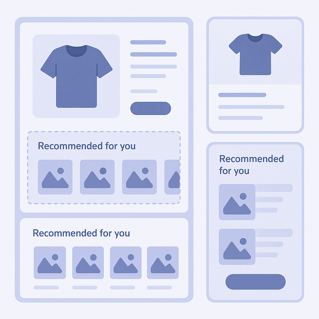
The very first decision in app selection is which pages you want to show recommendations on. Is it only product pages? Do you also want them on the cart page or just before checkout? Or do you want recommendations on the home page and blog posts as well? The app you need will differ. Even on a product page, the logic changes depending on whether you want “recommended for people viewing this product” or “frequently bought together.” If you implement an app without clarifying this, you often end up leaving the default settings as-is and seeing similar product blocks on every page, which makes it hard to measure any real impact.
A very common mistake is “let’s just show them everywhere.” You add recommendation blocks to the home page, product pages, and cart page, and the result is that user attention gets scattered and the primary buttons you want them to click – Add to Cart and Checkout – become harder to notice. This is especially harmful for higher-ticket stores, where the more distractions you add, the more your exit rate tends to rise. A safer approach is to start with one or two placements, monitor the numbers, and then expand gradually if it makes sense.
Here are some examples of recommendation types that tend to work by page. On product pages, the staples are “frequently bought together,” “different colors and sizes,” and “higher-end models.” On the cart page, use upsell and cross-sell that do not disrupt the purchase decision, such as “compatible accessories for items in the cart” or “warranty and care products.” On the home page, focus on its role as an entry point with things like “bestsellers” and “recently viewed items,” which helps keep the user journey clean and focused.
Understand the differences in recommendation logic
Even if two apps are both labeled as product recommendation apps, the logic they use under the hood can be very different. Some official Shopify themes include a Related Products section, but in many cases it simply shows products from the same collection or with the same tags. When you add an app, you gain access to more sophisticated logics such as “based on browsing history,” “based on items in the cart,” or “based on top sellers.” Before installing anything, always check the help or documentation to see exactly what conditions the app uses to decide which products to show.
Recommendation logic broadly falls into two types: rule-based, where you as the merchant define the conditions, and data-driven, where the system learns automatically from browse and purchase data. Rule-based logic makes it easy to enforce things like “always show this accessory with this product,” but if you have many SKUs you will not be able to keep all the rules up to date. Data-driven logic reduces day‑to‑day effort, but can skew results, for example by rarely surfacing new products or showing only bestsellers and making the line‑up feel repetitive. Neither is inherently better; you decide the balance based on your store’s size and how frequently your catalog changes.
For instance, if your store has a few hundred SKUs and you add new items every month, managing everything purely with rules is unrealistic. On the other hand, if you sell high‑ticket bundles or subscriptions, there may be specific combinations where you absolutely want a human to define the set. In that case, an app that lets you run automatic recommendations by default, but manually override and fix key combinations, will be easier to operate. When reviewing app descriptions, look for terms like “manual recommendations,” “override,” or “pin items” – these usually indicate that manual fine‑tuning is possible.
Clarify fixed vs revenue-based pricing models
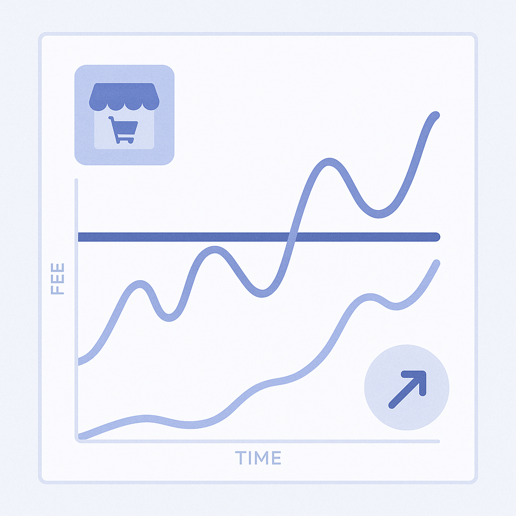
Recommendation app pricing is generally either flat monthly fees, revenue-based commissions, or a mix of both. Revenue-based models may look low‑risk at first glance, but you need to check carefully how revenue is counted. For example, is every order that includes an item shown by the app counted, or only orders for products that were clicked through the app? The effective fee can differ dramatically. If your store has high traffic, a high revenue‑share rate can lead to unexpectedly large costs during peak seasons.
Flat‑fee pricing, on the other hand, makes it easier to decide how much you are willing to spend each month. But three apps at several dozen dollars each quickly add up to tens of thousands of yen per month and hundreds of thousands per year. A typical failure pattern is that you rigorously measure impact at launch, but after about six months ownership changes hands internally and the apps end up “just sitting there.” Even with flat fees, at least once a quarter you should check whether revenue attributable to the app exceeds its monthly cost, and be ready to downgrade or switch if it does not.
When comparing pricing, it is also important to know exactly when the fee will jump. Confirm in advance when you will be moved from free to paid, and under what traffic or order conditions the app will automatically upgrade you to a higher tier. During the trial, contact support once and ask, “With a store of this size, what would our fees look like in peak season?” Doing this upfront makes it much easier to avoid unpleasant cost surprises later.
Check theme compatibility and the implementation flow
Two things that often get overlooked when installing a recommendation app are how well it plays with your theme and the actual implementation steps. On newer Online Store 2.0 themes, most apps can be added as blocks directly from the theme editor, but older themes may require editing code. When code edits are involved, a later change in staff can leave people unsure what was modified, and theme updates become riskier, with issues like recommendation sections suddenly rendering incorrectly.
Before installation, always review the Installation or Setup sections in the app’s help center or on its Shopify App Store listing. Whether it says “one‑click auto install” or “requires adding a snippet to your theme” will dramatically change the work involved. If you rely on an external agency or freelancer to manage your theme, discuss not only the initial setup cost for this app, but also the maintenance cost when the theme is updated, so you are not surprised by additional invoices later.
It is also crucial where on each page the recommendation block appears. For example, if you place a large recommendation block at the top of the cart page, users may look at the suggested products before they even check their cart contents, which can increase back‑and‑forth actions and friction. Avoid using the default layout blindly; instead, assume you will test two or three placement patterns in a staging or limited‑traffic environment, and choose an app that makes such adjustments easy.
Measurement and A/B testing make the difference
Recommendation apps work best when you keep tuning based on data instead of treating installation as the finish line. At a minimum, you should be able to see three metrics at launch: revenue via the app, clicks via the app, and impressions (number of displays). With these, you can tell whether items are being shown but not clicked, or clicked but not converting, and identify bottlenecks. Some apps integrate with Shopify analytics to provide more detailed reports, but as a baseline, check whether those three numbers are available.
How easily you can run A/B tests or pattern comparisons also matters for long‑term improvement. You might test, for example, what happens to completion rate if you reduce the number of recommended items on the cart page from four to two, or move the recommendation from the bottom of the product page into the middle of the description. The same app can produce very different results depending on layout. Even if the app has no built‑in A/B testing, simply changing settings for a defined period and then comparing Shopify metrics such as average order value and conversion rate before and after can yield useful insights.
Another common mistake is judging performance by comparing total store revenue in months with the app installed versus months without. Seasonality and campaigns have a much bigger effect than the app itself, so this will not give you a fair read. Where possible, compare within the same time window: pages with and without recommendations, or sessions that touched a recommendation vs those that did not. And look at trends over at least one to two months before deciding.
How to apply these ideas with RecoBoost
RecoBoost is a Shopify‑native AI recommendation app designed to balance “where and what you show” with “how much is automated.” You can configure separate widgets for key placements like product pages, cart pages, and the home page, which makes phased rollout easy – for example, starting only on product and cart pages. Its recommendation logic is based on automatic learning, while still allowing you to lock in specific product combinations manually, enabling a hybrid setup where you fully control important bundles. On the pricing and measurement side, you can use the free trial and built‑in reports for RecoBoost revenue, clicks, and impressions to compare performance before and after installation. This approach suits stores that want to start with one or two small recommendation placements and expand coverage gradually based on the numbers.
What matters in choosing a recommendation app is not a vague sense that “it looks good,” but clearly defining for your own store where you want to show what, how much operational effort you can realistically invest, and how much you are willing to spend. If you compare candidate apps through the three lenses of placement and logic, pricing and implementation flow, and ease of measurement, you can avoid being dragged around by overly complex tools and instead build a recommendation setup that actually fits your store.