Designing cart recommendations that lift AOV without hurting checkout
Cart recommendations do not automatically increase revenue. Done poorly, they depress conversions. This guide covers where to place them, what and how many items to show, what copy to use, and how to implement them in Shopify, plus how to apply RecoBoost effectively.
Cart recommendations are not a magic switch you flip to increase revenue. If you implement them poorly, you can actually raise cart abandonment and lose sales. The key is to design cart recommendations as a gentle nudge for shoppers who are already ready to buy. You want to surface highly relevant products, in a position and quantity that do not get in the way, with simple, unobtrusive copy. This article organizes how to design recommendations on the Shopify cart page in a way you can actually implement: concrete patterns, pitfalls, and failure cases. It is detailed enough that you can sit down with your designer or developer tomorrow and use it as-is in your discussions.
Focus the goal of cart recommendations on add-on purchases
On the cart page, recommendations should not be used to “show other products and get people browsing around again.” Their role should be narrowed to “increasing add-on purchases for customers who have already decided to buy.” The cart sits at the end of the purchase journey, and what you should be helping users do here is finish their decision quickly, without confusion, and in a pleasant way.
For example, say your store’s average order value is 5,000 yen. If just 10% of orders get an extra 1,000-yen item from the cart, theoretical revenue goes up by around 2%. On the other hand, if your cart recommendations cause conversion rate to drop by 0.5 points, the decline in base sales can easily outweigh the gain. In other words, cart recommendations can end up “net negative for revenue,” even though you added them to increase it.
That is why cart recommendations must work as both “a feature to lift revenue” and “a feature that does not interfere with checkout.” Concretely, you should only show a small number of highly relevant items, and use a layout that does not pull the eye too far away from the checkout button. If you get this wrong, no matter how advanced your recommendation logic is, you will not see meaningful results.
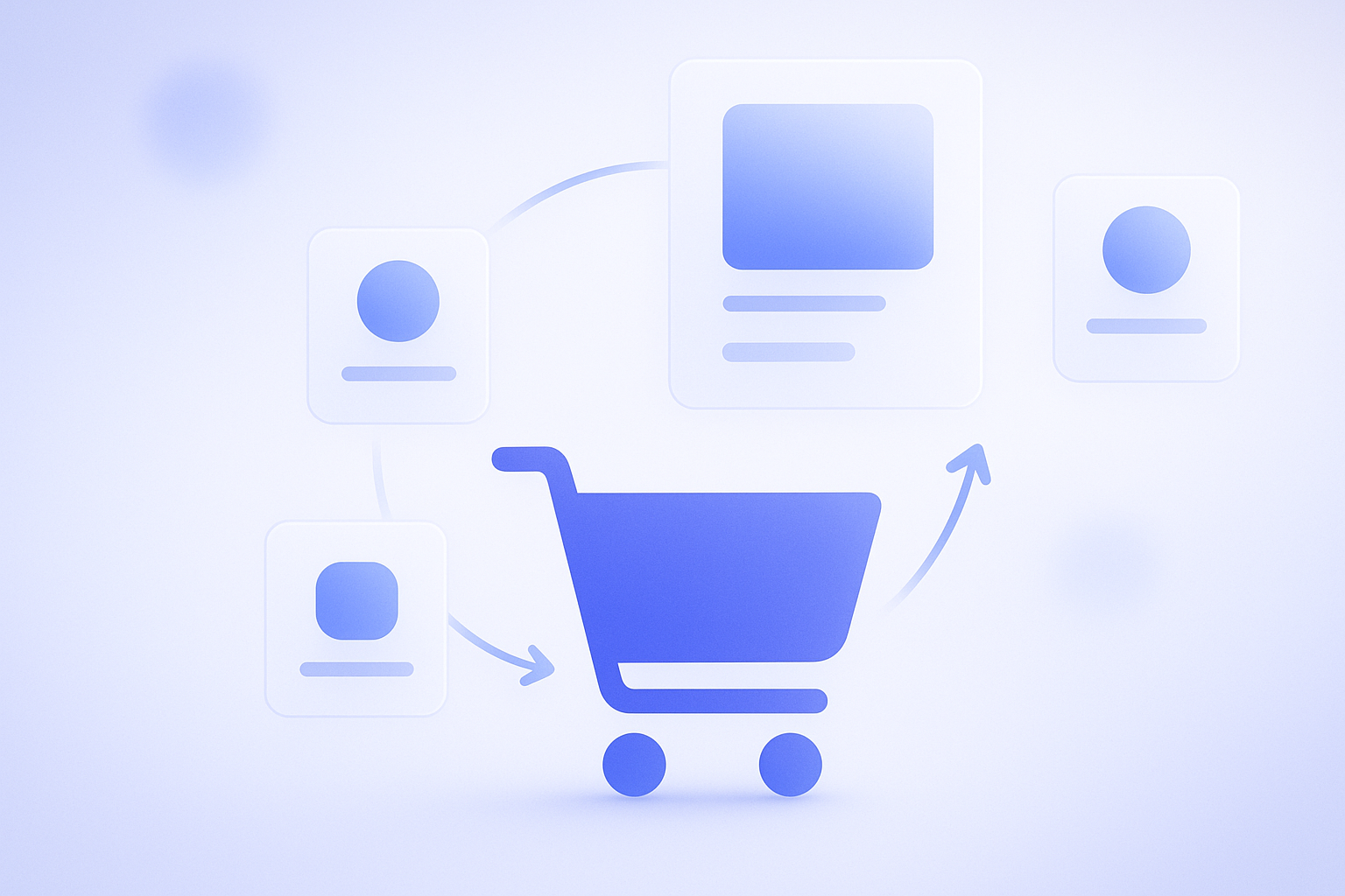
Where and how many to show: default UI placement patterns
The most manageable layout for cart recommendations is to “display 2–4 items in a horizontal row directly under the list of items in the cart.” The reason is that the eye naturally moves there right after confirming the items to be purchased, and the checkout button is still easy to find with a quick scroll down.
When deciding how many items to show, start from the smartphone view and think in terms of “2–3 items.” Once you go to 5–6 items or more, the page gets long, and the checkout button is pushed further down. At one apparel store, switching cart recommendations to show 8 products increased average time on the page, but the rate of moving on to checkout visibly dropped, and they quickly reverted to showing just 3 items.
Patterns to avoid include large popups that appear in the center of the screen, and layouts where a long list of recommendations sits above the checkout button and pushes it down. These easily give customers the impression that “the store is trying too hard to make me buy,” which is especially frustrating for repeat customers. If you absolutely must use a popup, limit it to a single display right after an item is added to the cart, make it easy to close, and operate it very cautiously.
What to recommend: three standard cart-based patterns
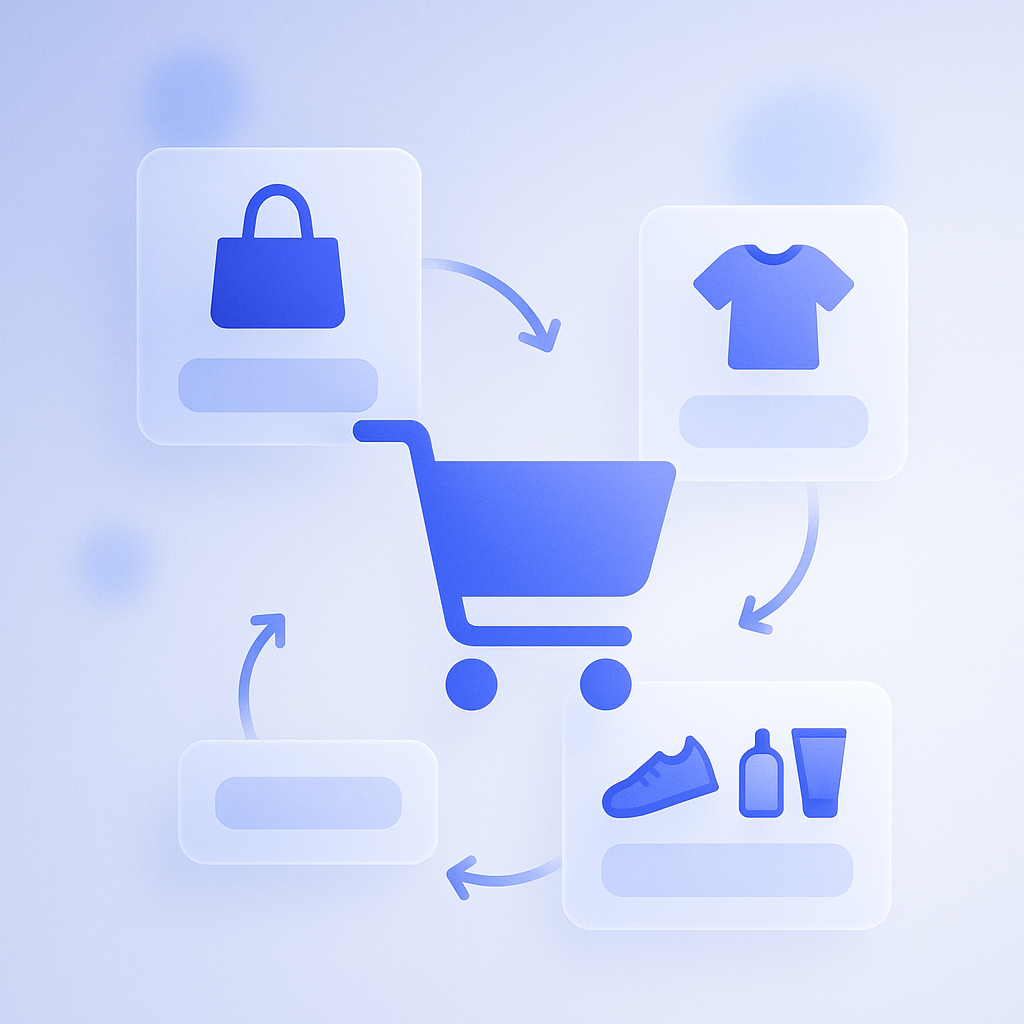
To get results from cart recommendations, you need clear rules for “which products to show.” Instead of simply listing bestsellers, you will get more stable purchase rates and a better experience if you design around how each product relates to what is already in the cart. Below are three basic patterns that are practical in day-to-day operations.
- Show accessories and consumables that are often bought as a set, such as displaying cotton pads or a travel case when skincare items are in the cart.
- Show products in the same category and similar price range, such as alternative colors or similar designs from the same brand when a T-shirt is in the cart.
- Show products that are frequently bought together, based on purchase history data that reveals common “bought together” combinations.
The pattern that tends to perform best is the first one: “items that are often bought as a set.” For instance, a coffee bean store can simply offer combinations like “coffee beans + filters” or “coffee beans + tins” and see a steady build-up of small add-on purchases. If you focus on accessories and consumables with low cost of goods, you also see a stronger impact on profit margin.
A common failure pattern is “stuffing the slot with clearance or slow-moving items.” Showing a bunch of discounted products that are only weakly related can damage your brand image and make customers wonder “is this product not selling well?” It is safer to design cart recommendations so they reinforce the feeling that “the item I just chose was the right choice.”
Copy and price display: propose without pressure
Even when you are recommending the same products, copy and price presentation dramatically change how they are perceived. On the cart page, you want a tone that “affirms the current choice while casually suggesting what else might be useful.” By contrast, copy that denies the current choice or rushes the purchase tends to drive cart abandonment.
For headings above the recommendation area, straightforward phrases like these are easy to use:
- “Frequently bought together”
- “You might also like”
- “Recommended for people who use this item”
For price display, it is often better to keep things simple so customers can easily imagine the total together with the items already in the cart, instead of showing original price, discounted price, and discount rate all at once. When there are too many numbers, you force customers to “do the math” in the cart, which increases psychological friction before checkout. On the other hand, if you have a free-shipping threshold, show a notice like “Spend XX yen more to get free shipping” near the top of the cart, and place recommendations directly under it. That makes it easier to trigger the behavior of “I am close to free shipping, so I will add something.”
Be careful not to overemphasize discounts or scarcity. Strong hooks like “50% off today only” or “Ends in 2 hours” can spike short-term response, but repeat customers in particular will start to feel “I am being rushed every time.” On the cart page, prioritize evergreen copy that works consistently, and leave aggressive, campaign-style messaging to your homepage or special landing pages for more stable long-term performance.
Implementation approaches for Shopify cart recommendations
There are two main ways to implement cart recommendations in Shopify: building them into the theme, or using an app. Whichever you choose, decide upfront on the principles for “goal,” “placement,” and “what to show” described above. That will save you from a lot of rework in development and configuration.
For theme-based implementation, first check whether your theme has built-in sections or blocks for cart recommendations. Many Online Store 2.0-compatible themes let you add “recommended products” or “related products” blocks to the cart page or cart drawer. From there, you can manually specify particular products or collections, or refine collection conditions to build a “cart-specific add-on product set” that is easy to maintain.
If you use an app, it is usually better to prioritize the flexibility of the UI settings—such as “how it can be embedded in the cart,” “whether it stays unobtrusive on mobile,” and “whether you can easily adjust the number of items shown”—rather than getting hung up on which recommendation logic it uses (browsing history, purchase history, AI, and so on). Even the most advanced algorithm can put you in the earlier scenario of “higher revenue per order but lower conversion rate” if you cannot fine-tune how it appears on the cart page.
How to get the most out of RecoBoost
When using RecoBoost, a good starting design is to create a single “cart recommendation slot” and show 2–3 items in it. Then configure rules that prioritize “frequently bought together” products based on purchase history and high-margin accessories, and verify the exact placement on both desktop and mobile cart screens. Every 2–4 weeks, compare “cart-to-checkout progression rate” and “items and revenue per order” while making small adjustments to the number of items shown and the product groups. This makes it easier to discover the optimal pattern for your specific store.
Cart recommendations are not a “nice-to-have feature you just turn on,” but a deliberate design to “increase add-on purchases without disrupting checkout.” By narrowing the objective to add-on buying and deliberately tuning four elements—placement, number of items, product rules, and copy—then repeatedly implementing and testing them via your Shopify theme or apps, you can raise revenue and customer experience at the same time.