Four High-Impact Recommendation Placements to Grow AOV
The fastest way to raise AOV is how and where you place products. With four well-chosen recommendation spots, you can lift AOV 5–10% without raising ad spend. This post outlines concrete Shopify placement patterns you can try today and what to watch out for.
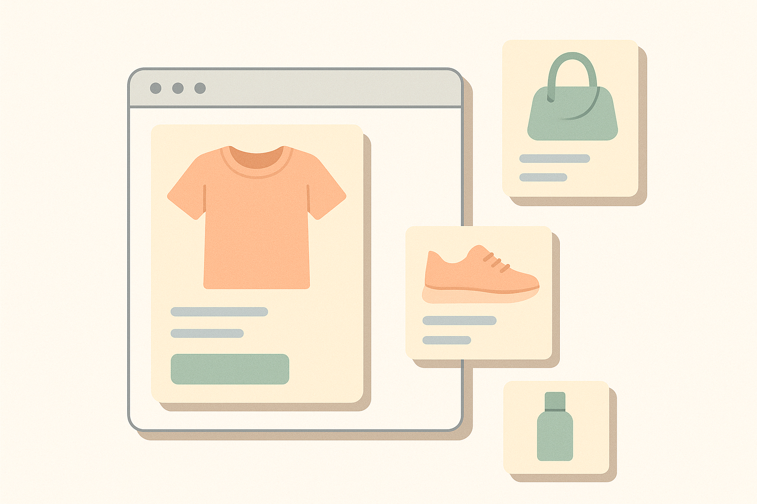
If you want to increase average order value (AOV), the first thing to work on is which products you show, where, and how. Even without increasing ad spend, simply rethinking where you place recommendations can easily lift AOV by 5–10%. On the other hand, if you get the placement wrong, revenue from recommendations can stall at just 1–2% of total sales. Implementation effort is the same, but results change dramatically depending on placement. This article organizes four recommendation placements that tend to move AOV for Shopify stores, along with key implementation points for each. In short, you want to cover four spots—product page, cart, pre/post-checkout, and thank-you page—and design each with a clear, distinct purpose.
1. Product page: boost “bought together” with related items
The most consistently effective placement is recommendations on the product page. Shoppers are in comparison and consideration mode, so “how about these together as well?” feels natural and is easy to accept. This directly impacts AOV for categories where set purchases are common, such as apparel, cosmetics, and gadgets. In practice, it usually makes sense to start by optimizing recommendations on product pages first.
Typical placements are either directly under the product description or as a “related products” section near the footer. If you try to squeeze recommendations into the first view and push core content like product images and price below the fold, you risk hurting conversion rate. As a rule of thumb, place recommendations right after shoppers have seen the key information about the product itself, and prioritize not disrupting the main purchase journey.
Choose the type of recommendation based on your objective. If your top priority is “get this product purchased,” then show “alternative suggestions” from the same category. If your goal is to increase AOV by encouraging add‑ons, prioritize “bundle suggestions” or “accessory suggestions.” For example, on a smartphone product page, you would line up cases, screen protectors, and wireless chargers. If you mix in loosely related items, click-through rate will suddenly drop, so start with a small number of items (around 4–6) and watch how shoppers respond.
Depending on your Shopify theme, you may already have built-in “recommended products” or “similar products” blocks. In that case, simply tuning the target collection and item count from the theme editor alone can be enough to improve AOV. Before bringing in an advanced AI recommendation app, test with these existing blocks to see which positions, item counts, and headings perform best. That will make later optimization smoother.
2. Cart page: drive impulse add-ons with essentials and low-priced items
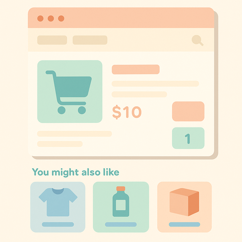
Recommendations on the cart page are a core lever for increasing AOV. At this point, purchase intent is strong, so suggesting “easy-to-forget essentials” or “one more small item to unlock free shipping” is a natural way to nudge order value up. In fact, after implementing cart recommendations, there are cases where AOV for affected sessions rises by more than 10%.
There are two main design points. The first is price range. If you show items that are clearly more expensive than the main product, the psychological hurdle rises and clicks drop. In the cart, focus on items priced around 20–30% of the current cart total, or low to mid-priced products in the 1,000–2,000 yen range, which are easier to accept. The second is clarity of use. Briefly explain in the heading or copy why it is convenient to buy the item now—“Waterproof spray for these shoes,” “Extended warranty for this PC,” and so on. This makes additional purchases more likely.
A common mistake is pushing “storewide bestsellers” that have nothing to do with what is in the cart. Pageviews go up, but most of those clicks are just “looking around,” and do not result in extra purchases, so AOV barely moves. Even when you feature bestsellers, create rules to prioritize items from the same category as those in the cart, or items that have historically been bought together frequently.
On Shopify, it is common to either edit the cart page template to insert a recommendation block, or load recommendations into a drawer (slide-out) cart via an app. In both cases, check that adding recommendations does not push key buttons below the fold, and that on mobile the recommendation section is not so long that it causes drop-offs. Adjust with those points in mind.
3. Pre- and post-checkout: staged upsells
Recommendations around checkout can have a big impact on AOV, but if you get the implementation or UX wrong, they easily cause abandonment. Treat “before checkout (immediately after cart)” and “after checkout completion” as separate steps with different roles. Before checkout, focus on truly necessary upgrade offers. After checkout, focus on lighter add-on suggestions suitable as “extra purchases.” Designed this way, you can raise AOV without hurting the experience.
A classic pattern for pre-checkout upsell is “discounted bundles.” For example, when a user puts a 5,000 yen single item into the cart, you offer a “3-pack for 12,000 yen.” Because this step jumps the price up, if you do not clearly show the discount rate or free-shipping threshold, you can actually create distrust. Limit the bundle offers to one or two options so you do not cause decision fatigue.
Another pattern is inserting an upsell right after checkout completes (around the thank-you page). Since payment has already been processed, you can suggest additional purchases without interfering with the main order. However, if you push too many high-priced items, it can feel like “another payment already?” and conversions will be low. For recommendations around checkout, narrow candidates to products priced roughly 30–50% of the average order value, where there is a clear, rational reason to bundle them. That tends to align better with shopper psychology.
On Shopify, how much you can customize the actual checkout screen depends on your Shopify plan and which apps you use. As a result, many stores rely on a “dedicated upsell page inserted between cart and checkout” or “additional offer blocks shown after checkout is complete.” When implementing, avoid heavily altering payment-related UI. Instead, keep the number of offers and the wording minimal, and test those first—that is usually the most practical approach.
4. Thank-you page: offers that drive repeat purchases and reviews
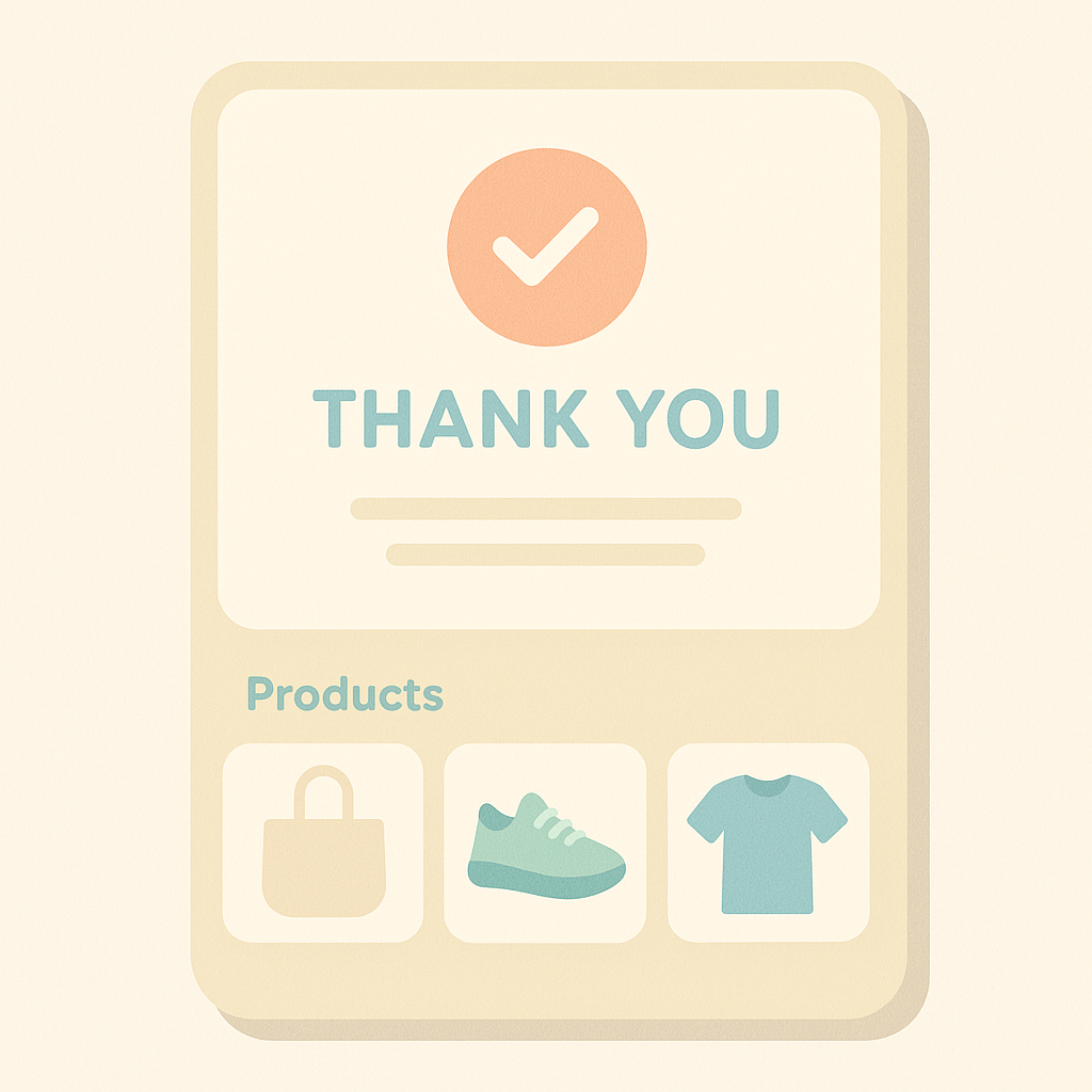
Recommendations on the thank-you page are about medium- to long-term revenue rather than immediate AOV. Right after ordering, shoppers are most satisfied with the experience and feel the most goodwill toward your brand. If you gently introduce triggers for the next purchase or highlight related items at this moment, you can improve repeat purchase rate and encourage reviews.
Concretely, combine the following elements. First, recommendations for products related to the current order. For example, for a shopper who ordered coffee beans, you might introduce another blend to try next time, storage containers, or drippers. The key is to adopt a “for your next order” tone rather than “buy this now.” Second, pair recommendations with discount codes or points. For instance, “X% OFF coupon valid on related items for your next purchase.” Giving recommendations that context tends to increase coupon usage.
A common misstep is treating the thank-you page like an “ad slot.” If you flood it with too many products or stack pop-ups, shoppers feel “I finally bought and they are still hard-selling me,” which damages the brand experience. Keep thank-you page recommendations to around 4–6 products and keep the copy restrained, so they work in favor of building the future relationship.
On Shopify, you can add content to the order status (thank-you) page via the theme or apps. When implementing, place a small recommendation block below the existing shipping details and order summary, alongside links to “how-to” content or blog posts. That way, recommendations are perceived as part of helpful information rather than as a hard sell.
Metrics to measure impact and how to test
Before you add more recommendation placements, decide what success means. The simplest is to compare overall AOV and order volume before and after rollout. However, campaigns and sales can blur the impact, so also track revenue and click-through rate (CTR) from recommendation blocks to help isolate causes.
In most cases, tracking the following three is enough. First, the “share of revenue from recommendations”: what percentage of total sales comes from orders where shoppers clicked a recommendation block. Second, the gap between “AOV for sessions with recommendations” and “AOV for sessions without recommendations.” For example, if sessions with recommendations average 6,000 yen and those without average 5,400 yen, you can infer recommendations are lifting AOV by roughly 11%. Third, “CTR by page” so you know which placements actually get clicks.
When testing, avoid changing everything at once. Roll out in stages: product pages → cart → pre/post-checkout → thank-you page. For example, start with product pages only for 2–4 weeks, and if you see impact, extend to the cart. This makes it easier to see what is working where. Also test “placement” and “contents of recommendations (which products are shown)” separately so you can pinpoint which factor is driving results.
In summary, you should not randomly add more recommendation slots. For AOV-focused initiatives, define a clear “role” and “price band” for each placement, and measure impact using AOV and revenue from recommendations.
How to leverage this with RecoBoost
If you are using RecoBoost, first create separate recommendation blocks for each of the four placements covered here: “bundle suggestions on product pages,” “essentials and low-priced items in the cart,” “upgrade offers around checkout,” and “future candidates plus informational content on the thank-you page.” Then, in RecoBoost, tune conditions like “relevance to items in cart” and “price range,” and review changes in recommendation-driven revenue and AOV weekly. This lets you keep only the high-performing placements without bloating your site. Let AI handle the contents of recommendations, while your team controls where they appear and for what purpose. With this division of roles, you can keep improving AOV without increasing operational workload.
To increase AOV with recommendations, design around four roles and placements: product page, cart, pre/post-checkout, and thank-you page. For each step, consider what the shopper is thinking, decide which products and price ranges to propose, and then adjust gradually while measuring AOV and recommendation-driven revenue. Done this way, you can lift sales without increasing ad spend.