Designing effective upsell and cross-sell flows in Shopify
To make upsell and cross-sell work in Shopify, you must decide which products to target, on which screens, and with what offers. This article walks through practical design steps and common pitfalls for product pages, cart, and post-purchase flows.
Even when merchants add upsell and cross-sell to Shopify, many stores stop at simply “showing some recommendations” and calling it a day. To really lift your average order value, you first need to design which products you will target, on which screens, and with what kind of offer – and only then implement that logic using apps or your theme. This article organizes the basics of that design work in plain language so Shopify operators can start revisiting their store today. We will look at product pages, cart, and post-purchase, covering what to do and where mistakes happen, and then add one short paragraph at the end with ideas for using RecoBoost. We start from the standard features described in Shopify’s official documentation, and reshape them into flows that are easier to run in day-to-day operations. Some features differ depending on your theme and apps, so always check your own environment before implementing. Any numbers mentioned are only rough benchmarks – assume you will validate everything on your own store. Shopify’s official docs are used as the primary reference for online store features, apps, and checkout extensions. We do not go into steps that depend on specific app or theme names; the focus is on how to design the logic. To stay resilient to Shopify spec changes, we talk about concepts and structure rather than detailed UI. The distinction between upsell and cross-sell here is also explained at a level that helps you make operational decisions. For deeper technical setup, refer to Shopify Help or your app docs as needed. Upsell and cross-sell are basic levers for growing revenue without increasing ad spend. When they are designed well, it is not unusual to see average order value rise by 10–20%. But if you get the design wrong, you end up with “annoying popups just because we can,” which simply adds friction and increases abandonment. Use this article to take stock of how your own store is set up. In the next section we will first clarify terminology and goals, then move into screen-by-screen design. We will also touch on what order to roll features out and how to think about priorities. If you are thinking “we do not have upsell or cross-sell in place at all,” that is still fine. The explanation starts from the basics, so work through the sections you need and roll things out step by step based on your store’s situation. If you already use some kind of recommendation app, read while checking which patterns your current setup matches. Later on, we will also look at concrete examples of failure patterns. Because running multiple tactics in parallel easily hides what is actually working, we will briefly touch on how to approach testing as well. The goal is to get results without ballooning operational workload. This article deliberately does not deal with advanced conditional logic like stock-aware rules or complex shipping restrictions. We focus on the minimum design you should get right first. Advanced setups are better considered after that foundation is in place; you will end up with a more stable operation. In the next section, we will organize the definitions and goals of upsell and cross-sell. With this groundwork, you can narrow down which tactics fit your store. We will finish by touching on how to think about AI recommendation apps like RecoBoost, but the main body focuses on a tool-agnostic basic design. How you design matters more than which specific tool you choose; that is what leads to durable results. Work through the content while organizing the information you need. You can also use this as a checklist to review your current initiatives. Let us start by aligning on terminology. Many operators still mix up upsell and cross-sell, so we will first make their differences and use cases explicit. Once you understand the different goals, it becomes much easier to decide what to show on which screen. With that in place, we will move into concrete design. The end goal is for you to be able to draft a simple design memo tailored to your store. Read each section while mapping it to your own situation. Taking notes as you go will make later implementation and review far smoother. Next, we will confirm the definitions and differences between upsell and cross-sell. That will also highlight priorities and where to focus when measuring impact for each tactic, and from there we will move step by step into screen-level design. By the time you reach the end, you should have concrete steps you can start acting on today. The content is limited to what you can typically achieve with Shopify’s standard features and common app capabilities. We do not cover flows that assume special integrations with external systems. Start steadily with what you can fully control in-house. The groundwork explanation up to this point may feel long, but once you line it up, your design decisions will be far more consistent. When the operator themselves understands the intent behind the design, it becomes easier to share internally and to work with external partners. Now let us get into the core topic, starting from the upsell and cross-sell basics.
Clarify the difference and goals of upsell vs cross-sell
The first thing to pin down is the difference in goals between upsell and cross-sell. Upsell means suggesting a higher-priced, higher-value product that fulfills the same underlying need as the item the customer is considering. Cross-sell means suggesting additional products that are convenient to buy together with the item in question. Both are ways to raise average order value, but the right timing and content of the offer differ. For example, if a customer is viewing a 3,000 yen T-shirt, showing them a 5,000 yen T-shirt in the same design but with better fabric is an upsell. Suggesting a laundry net or innerwear to go with the T-shirt is a cross-sell. Both can work well, but if you do not match them to the customer’s step in the buying journey, the offer starts to feel pushy and can actually cause drop-off. Being explicit about the goal at the design stage is a prerequisite for success. Upsell and cross-sell are often thought of as “just ways to push the order value up,” but at the operational level it is more effective to frame them as “helping customers avoid regret later.” If you prevent returns due to choosing the wrong size, or avoid re-orders because someone forgot a necessary accessory, you will also raise LTV over time. Chasing short-term basket size alone risks damaging the long-term relationship. The key is to use “will the customer feel genuinely glad they bought this?” as your decision filter. If the whole team shares this standard, it becomes much easier to have discussions like “is this upsell starting to feel like a hard sell?” Be especially careful about forcing stock you simply want to clear; that quickly worsens the experience. Upsell and cross-sell each have situations where they shine. In general, on earlier steps like the product page or early cart view, you should go easy on cross-sell and first let customers decide what they are going to buy. After that, you can use upsell and cross-sell to help answer “is this really the right choice?” and “is there anything I should pick up together?” in a natural way. Keeping the mapping between goals and touchpoints in mind, the next section moves into concrete design. With the upsell vs cross-sell difference clear, you can then decide on which Shopify screens to run which type of offer. The basic rule of thumb is “one main objective per screen.” If you cram both upsell and cross-sell onto the product page, the page loses focus and conversion can drop. That is why getting the terminology and goals straight is so important.
Decide which products to target first: where design starts
The first decision in upsell and cross-sell design is which products to anchor everything on. If you try to show recommendations for every product in the same way, your operational workload balloons and it becomes harder to see what is actually working. Start with products that account for a large share of your revenue. For example, if the top 20% of products by sales make up most of your total revenue, designing upsell and cross-sell just for that group can still have a big impact on your overall average order value. When selecting target products, narrow down using perspectives like these. One is “core products that tend to be bought as a single item.” Another is “categories that naturally lend themselves to related items.” If you see patterns like “people buy only a smartphone case and nothing else” or “shoes sell but care products do not,” prioritize cross-sell design there. Conversely, for products that already sell as bundles, or high-ticket items that are inherently bought as a single piece, you are often better off not forcing extra cross-sell. As a starting point, take each key product and ask “if this goes into the cart, what would feel like a natural thing to suggest?” and form a hypothesis product by product. Trying to do this for your entire catalog at once is overwhelming, so begin with your top 10–20 best-sellers. Even a rough, handwritten list of “upsell candidates” and “cross-sell candidates” per item helps you organize your thinking. A common failure pattern is “jamming slow-moving inventory into cross-sell just to make it move.” If the relationship is weak from the customer’s perspective, those items will barely get clicked even if you show them. Recommendation blocks with click-through rates under 1% are likely just visual noise. First narrow down to combinations where customers would genuinely feel “nice to have together” or “worth upgrading so I will not regret it later.” If you decide on these basic product linkages at this stage, it becomes much easier to turn them into settings later in an app or theme. Even if you plan to design at the collection level in Shopify’s product admin, it still helps to jot down hypotheses like “these collections pair well with this other collection” in advance – it will sharpen your design considerably.
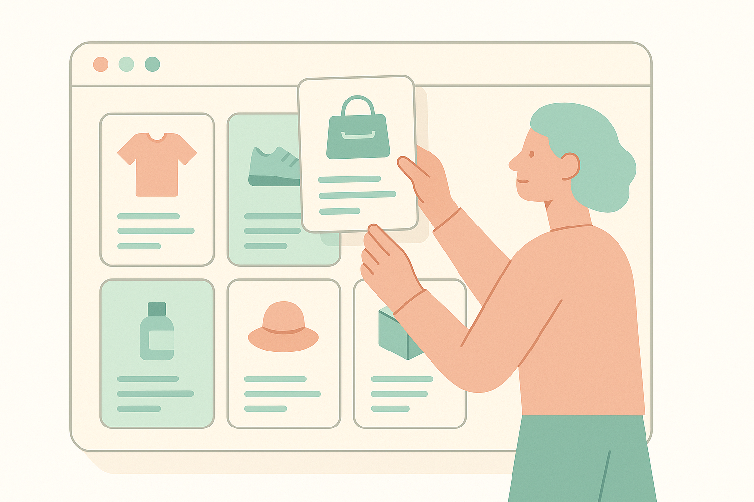
Design by screen: product page, cart, and pre/post-checkout
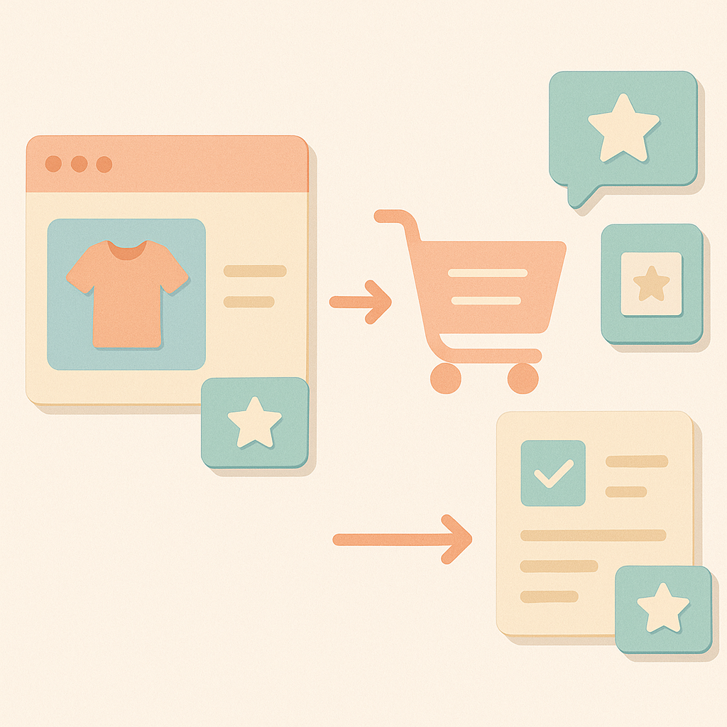
Once your target products are chosen, next decide on which screens you will surface offers. In Shopify, it is common to use theme features and apps to show recommendations on multiple touchpoints such as product pages, cart, and before and after checkout. However, if you turn everything on everywhere, the experience quickly becomes cluttered. You need to set priorities and deliberately limit where you show what. On the product page, the main job is helping the customer refine or change the product they are considering, so upsell-style offers are a good fit. Typical examples are switching to a different size or volume, a higher grade, or a bundle version. If you do show cross-sell at this stage, keep it to items that are “almost a given” to buy together – batteries, cables, care products, and other essential accessories. Think in terms of “if they buy this, almost everyone will also need these.” Next, on the cart screen, the decision to purchase is mostly made. Here, light-touch cross-sell works well as long as it does not get in the way of checkout. For instance, you might show a message like “Spend 1,000 yen more to get free shipping” with a few relevant items, or surface 2–4 clearly related products that are convenient add-ons. If you show too many items, you risk creating new indecision. Many Shopify themes and apps can show recommendations in a cart drawer (a slide-in mini cart on the side), but even there it is safer to keep it within one or two visible rows. Direct customization of the checkout page itself is limited by Shopify’s specs and largely reserved for Shopify Plus extensions, but pre- and post-checkout offers can sometimes be implemented via apps or customization of the order status page. Post-purchase offers shown after order completion are a good place to experiment with both cross-sell and upsell, because the customer has already decided to buy. Offers framed as “avoid forgetting this” or “a slightly higher-grade related item” feel natural here. Even so, do not overdo it; keeping it to one or two proposals is usually the most realistic approach.
Decide what to show: build on simple, maintainable rules
After you decide “for which products” and “on which screens” to show offers, you then need to get specific about “what to show.” At this point it is better not to jump straight into complex conditional logic. Start from simple rules that are easy to maintain. For upsell, for example, you might use a rule like “within the same product category, suggest items that are 20–50% more expensive” as your first choice. For cross-sell, build around items that are often bought together or feel natural as a set. Even just keeping everything within the same brand, or matching color and design, makes it easier for customers to choose. Some examples of simple rules: first, “upsell to different volume or size.” For instance, if a customer is looking at a 30-day supply for 1,500 yen, suggest a 90-day supply for 3,800 yen. The order value goes up, but the price per day often goes down, which tends to be a rational choice for the customer as well. Second, “cross-sell items that are frequently used together.” Typical examples would be a camera and a memory card, or sneakers and waterproof spray. A practical way to do this is to scan past orders, identify “top 3 products most often bought together with this item,” and lock those in as your default set. A common failure pattern is “too many recommendations” and “weakly related products mixed in.” For example, if you show a long list of miscellaneous goods that have little to do with skincare under a 4,000 yen toner, the customer is likely to think “I have no idea what to buy” and leave. Early on, limit each block to about 2–4 products and then swap items in and out based on whether they get clicks and are actually added to cart. Keeping the rules simple makes operations easier even if the person in charge changes, and also reduces the impact when Shopify or your apps change their specs.
Testing and iteration: use numbers and avoid overdoing it
Upsell and cross-sell are not “set and forget.” You need to review them regularly based on numbers. That said, trying to manage everything with rigorous A/B tests from day one is too heavy. Start by tracking a small set of basic metrics. The key ones are click-through rate on the recommendation area, add-to-cart rate from that area, and revenue share from upsell and cross-sell. For example, if an upsell block on a product page is shown 1,000 times and gets 20 or fewer clicks (CTR under 2%), you can reasonably assume it is not drawing interest. In that case, you should change the products or adjust the placement. A common pitfall is continuing tactics just because “it feels like sales are up.” When multiple upsell and cross-sell initiatives run in parallel, it quickly becomes unclear what is actually driving results. Early on, separate your review periods: for example, focus only on product page upsell for a while, or only on cart cross-sell, so you can judge each in isolation. When testing, keep the same configuration for at least one to two weeks. Daily revenue fluctuates enough that drawing conclusions from 1–2 days easily leads to wrong decisions. If you track on a weekly or monthly basis roughly what percentage of total revenue comes from upsell and cross-sell, your long-term improvement direction becomes clearer. You should also define guardrails to prevent overdoing it. Examples: “a maximum of two recommendation blocks per screen” or “limit popup-style offers to once per visit.” Without such rules, every new “handy” feature you add will spawn another recommendation zone, and your store soon feels noisy from the customer’s perspective. Make it a habit to use your own site regularly and check whether it feels stressful when you act as a customer. Use both numbers and your own experience to keep the balance right.
How to make the most of RecoBoost
All the design basics explained so far apply directly when you use an AI recommendation app like RecoBoost. First decide for yourselves “for which products,” “on which screens,” and “what to show,” and then use RecoBoost’s automatic recommendations and rule settings to execute that policy more efficiently. For example, you can design upsell and cross-sell just for your top 20 best-selling products, and then have RecoBoost’s AI automatically surface highly related candidate items. Because the app can also show click-through and add-to-cart rates, it becomes easier to judge from the numbers whether you are over-recommending or which combinations are actually working. Keep your store’s design principles at the core, and treat RecoBoost as a tool to speed up hypothesis building and validation. That way, you can improve upsell and cross-sell quality while keeping operational load under control. When you change your Shopify theme or overhaul your assortment, review your design memo alongside your RecoBoost settings so you can keep performance steady over time. Use it in a way that avoids heavy-handed selling, aiming to raise both average order value and the quality of the customer experience.
To wrap up, when designing upsell and cross-sell in Shopify, it is important to follow these five steps: 1) understand the different goals of upsell and cross-sell, 2) decide which products to start with and narrow your scope, 3) assign clear roles to each screen such as product page, cart, and post-purchase, 4) decide what to show based on simple rules, and 5) monitor the numbers, avoid excess, and review regularly. Even before you choose apps or compare features, articulating this design for your own store will dramatically improve both average order value and operational ease. Take stock of your best-selling products and screen flow, and start tightening your upsell and cross-sell design wherever it is easiest to act.