
How Many Recommendations Should a Shopify Product Page Show? Practical Limits and Design Rules
On Shopify product pages, adding more recommendation slots can easily backfire. Keep above-the-fold upsell blocks to 2–4 items and lower-page browsing blocks to 4–8, then tune by purpose. This article covers roles by block type, failure patterns, decision criteria, and a checklist you can apply.
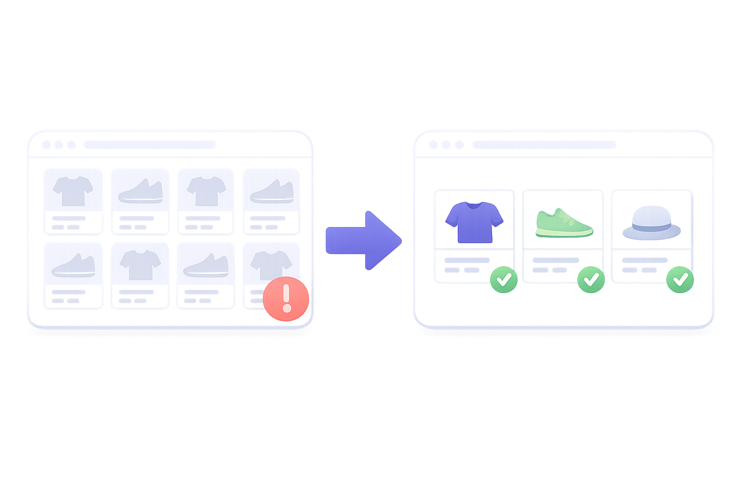
Deciding how many “recommended” or “related” products to place on a product page is surprisingly tricky. Many stores assume that showing more items will reduce missed opportunities and end up packing in ten or more recommendations. But once you overdo the count, shoppers often get overwhelmed and conversion rate or AOV actually drops. Because Shopify themes and recommendation apps make it so easy to raise the item count, it is even more important to be intentional in your design.
In practice, for product page (PDP) recommendations, you should first split blocks by purpose, then define a maximum count per block. For an upsell-focused block near the first view, keep it tight at 2–4 items. For a “browse also” block lower on the page, use 4–8 items at most. Once you go past that and line up ten or more, many stores see both click-through and purchase rates drop. Below, we整理 realistic design rules that are easy to implement on Shopify, the common failure patterns, and a checklist for deciding how many items to show.
First, map your recommendation blocks: what is each part of the PDP supposed to do?
Before getting into numbers, it is easier to make decisions if you categorize each recommendation area on the product page by role. You will usually see three types:
- Upsell block: increases order value by upgrading the same product, turning it into a set, or offering larger sizes (for example, nudging from a regular size to a large size).
- Cross-sell block: proposes related products that are convenient to buy together (for example, on a top’s product page, suggesting bottoms or a belt).
- Alternative/similar block: offers a “way out” when the current item is not a fit, by steering the user to products in a similar price range or category.
Many official Shopify themes ship with one or two default blocks such as “Recommended products” or “Related products”. If you add apps, you can split these three types into separate placements. Because everything looks like “recommendations”, you as the operator may be tempted to make them all heavy. Once you break them down by role, however, it becomes clear that the right item count differs by block.
In other words, on a product page you should not think in terms of “how many recommendations on the page in total”, but rather “how many items are acceptable per block”. That is the practical way to approach it. From the next section, we will整理 each block’s purpose and the rough range of item counts you should aim for.
Above-the-fold recommendations: 2–4 items as a baseline
Recommendations placed near the main image, price, or Add to Cart button show up right when the user is seriously evaluating the product. If the user clicks one of these, there is a real risk that their warmed-up purchase intent leaks away to a different item. So this position should be reserved for upsells or very strong related products, and the item count realistically held to 2–4.
You do sometimes see designs that display eight or more items in a horizontal carousel near the first view, but in most cases the downsides are visual distraction and slower page performance. Even if you cram many options into a scrollable carousel, users rarely look at everything; they usually decide based on the first few slots.
This is especially true on mobile PDPs where screen width is limited and only 1–2 products are visible at a time. In that situation, streaming ten recommended items still means only a small fraction of users swipe to the end. It is better to curate the truly important candidates down to 2–4 and move supporting items into a separate block lower on the page. That division of roles makes it easier to balance both click-through and conversion rate.
Lower-page “browse also” recommendations: up to 4–8 items
Recommendations placed mid-to-lower on the page—for example under the reviews section or after “About this product”—catch users at the point where they have gone through the information and are thinking “maybe I will look at other items too”. Here, the main purpose is driving browsing and offering alternatives, not upsell per se.
At this position, it is fine to show more items than above the fold. Even so, keeping it to around 4–8 items makes it easier for users to take in the list. With a grid layout, think along the lines of two columns by two to four rows. If you go beyond that, users tend to stop scrolling rather than “see everything”, and products buried lower down are virtually never seen.
The lower part of the page is also where you will be tempted to line up several blocks like “Recently viewed”, “Recommended for you”, and “Same series”. If you put eight items in each, you can easily end up with more than 20 products in a row and overload the page. If you really need multiple blocks, keep in mind a total cap such as “no more than 8–12 browse-oriented recommended items combined” to maintain balance.
Common failure pattern: recommendation design that just stuffs in more items
A frequent operator-side mistake is the mindset of “let’s add more options and hope something hits somewhere”, which results in recommendation-heavy product pages. A few typical patterns:
- A near-above-the-fold carousel with close to ten items, pushing product details below the first scroll.
- At the bottom of the page, showing eight items each for “Recommended”, “Related”, “Recently viewed”, and “Best sellers”, creating a long strip of 30+ products.
- The main recommendation block mixes similar items and cross-sell items together, leaving users unsure how to choose.
- A mishmash of products with different price bands and categories, which weakens the impression that the suggestions are “for me”.
With this type of design, clicks spread thin and every recommendation block ends up performing only so-so. The more products you display, the more images and data must load as well, increasing the risk of sluggish mobile performance. Because Shopify themes and apps let you change “number of items” in the admin UI with a few clicks, it is easy to overstuff. Avoid simply setting every block to its maximum allowed count.
Another pitfall is poor measurability. When you show many products across multiple recommendation blocks, it becomes hard to tell which block is actually working and which is unnecessary. Limiting the count does not just simplify user choice—it also narrows down what you, as the operator, need to validate.
Checklist for deciding the right recommendation count for your store
The optimal number of items varies by product type and price range. But before you start random A/B tests, check a few prerequisite points so your design does not drift.
- Page structure: Do the main product details (images, price, Add to Cart button) fit within one to two smartphone screens?
- Block roles: Are you at least separating roles for upsell, cross-sell, and alternatives/similar items instead of treating everything the same?
- Placement: Have you limited the recommendation blocks near the first view to a single block?
- Overall cap: Even when you add up all lower-page recommendation blocks, do you keep the total to around 12 items or fewer?
- Relevance: Is the recommendation logic for each block clearly defined (same category, same brand, bundle items, etc.)?
- Measurement: Do you have a way to track click-through and additional purchase rate for each recommendation block?
Once you clear this checklist, start with a basic setup such as “2–4 items above the fold plus 4–8 items lower on the page”. Then, monitor block-level click-through and purchases via recommendations and adjust the count up or down by one or two items at a time. This lets you approach the optimum without big, risky swings.
This is especially important for large catalog, general-merchandise stores. It is tempting to think “we have a lot of products, so we also need a lot of recommendations”, but there is a hard limit to how much information fits on one page. Start by aligning around a number of items that users can reasonably process in one view, then focus on which specific products you surface within that limit. That focus tends to drive results more directly.
By case: realistic recommendation count ranges
User comparison behavior follows rough patterns by product category. Treat the following as starting guidelines rather than strict numbers when you begin designing.
- Apparel/fashion: Focus on color variants, size variants, and outfit suggestions. Use 2–4 upsell/similar items near the first view, and 4–6 items in a lower-page “buy the full look” block.
- Cosmetics/household essentials: Often repeat or bulk purchases. Show 2–3 upsell options such as refills and sets, and 4–8 related products from adjacent categories.
- Furniture, electronics, and other high-ticket items: Alternatives and similar products are key because comparison takes time. To avoid decision fatigue, use 2–3 items above the fold and roughly 4–6 items lower on the page.
- Food and gifts: Even when there are many variations, it usually works better to offer 2–4 easy-to-choose options such as assortments or popular bundles rather than listing 10+ items on one page.
Across all categories, one principle stays the same: prioritize not mixing items with different intended uses or occasions over simply increasing the count. For example, on a furniture PDP it is clearer to users if you first show three choices from the same series above the fold and then show four accessories as a coordinated set below, instead of mixing “two color variants from the same series plus four completely unrelated small items” in a single block.
How to implement this in Shopify: concrete steps and decision points
On Shopify, you can flexibly change the number and size of recommendation blocks by combining theme settings and apps. Here is how to approach the actual adjustments in the admin.
- 1. Audit your current setup: Check your product pages on mobile and take screenshots to list out where recommendation blocks appear and how many items each is showing.
- 2. Label each block: Assign a role label to every block, such as “Upsell”, “Cross-sell”, “Alternative/similar”, or “Recently viewed”.
- 3. Keep only the necessary blocks: Limit the area near the first view to a single block, and merge lower-page blocks whose roles overlap.
- 4. Tentatively set item counts: For each role and placement, define starting values such as “2–4 items” or “4–8 items”.
- 5. Apply in the Shopify theme editor or app settings: Update the “number of products” in each section or widget, then check on real devices for layout issues.
- 6. Define a measurement window: Set a specific period, such as two to four weeks, to track click-throughs and revenue impact per recommendation block.
One key here is not to change too many things at once. If you alter both the above-the-fold count and the lower-page count at the same time, you cannot tell what drove the change in performance. Start by整理 the item count in the high-impact above-the-fold block, then move on to adjusting the number and size of lower-page blocks. Working in stages makes validation much easier.
Also, Shopify’s native features and most themes let you set the number of items for product recommendation sections as a numeric field. Instead of simply choosing the maximum, decide based on whether users can see all recommended items with one or two flicks on a smartphone. That will keep your design rooted in the user’s experience.
Using RecoBoost: test logic and item counts separately by block
When you use an AI recommendation or upsell app like RecoBoost, the thinking is the same. First, split the PDP into blocks for upsell, cross-sell, and alternatives/similar, and tentatively set each block to 2–4 or 4–8 items. Then, in RecoBoost, configure distinct recommendation logic and max item count per block, and compare click-through and additional purchase rates. Rather than letting the algorithm keep adding products, review one block at a time to see how many items in which block move which metrics. That is how you safely home in on the optimal recommendation count for your store.
For product page recommendations, the goal is not “the more, the better” but “define an appropriate number by role”. Use 2–4 items above the fold and 4–8 items for browse-oriented blocks lower on the page as a starting point,整理 block roles and placement, and then fine-tune gradually based on your own users’ behavior. By balancing quality and quantity in recommendations, you can prevent conversion drops and page exits while making it easier to design for higher average order value.